

O Cenário & O Conceito | The Challenge & The Concept
PT:
A necessidade de recomeçar nos obrigou a voltar ao início.
O Paraná Clube é uma instituição gigante, mas vinha de uma temporada pífia, falhando na missão de voltar à elite do futebol estadual. O clima era de reconstrução e, para reconstruir, nada faz mais sentido do que voltar às próprias origens para entender quem somos antes de dar o próximo passo.
Nossa missão ao desenhar os uniformes de 2024 era o de devolver o orgulho ao torcedor através da sua própria história.
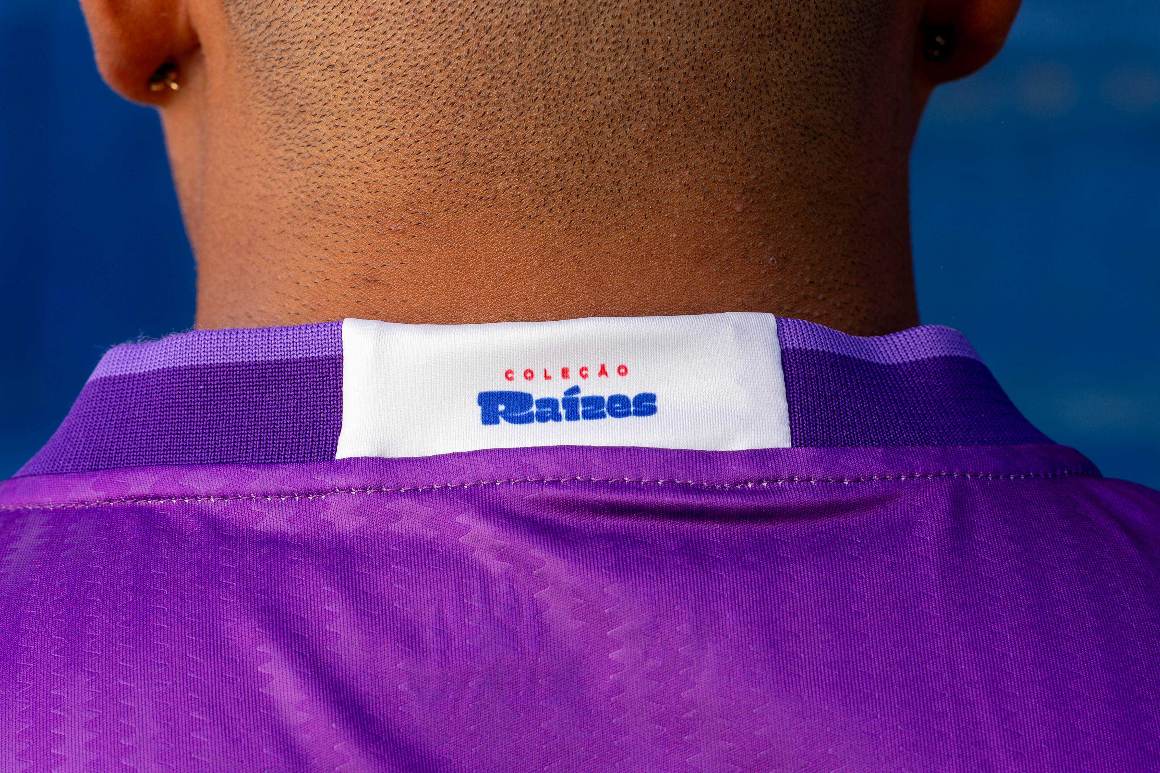
Assim nasceu a coleção Raízes.
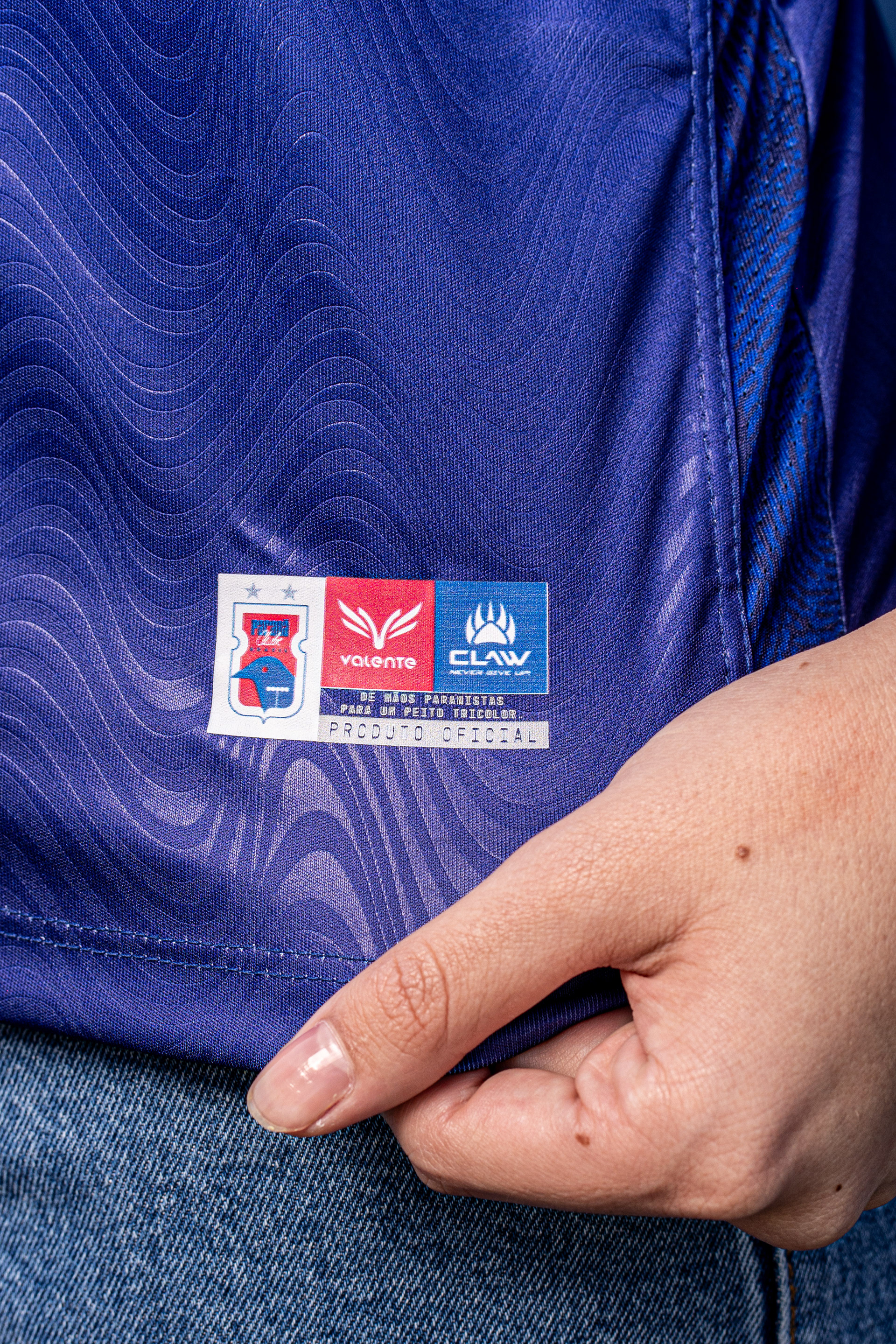
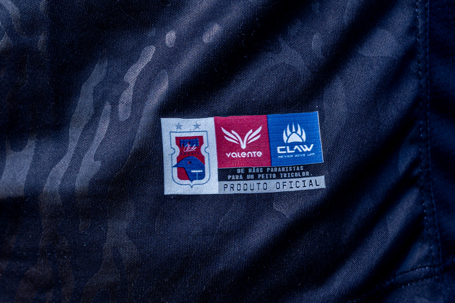
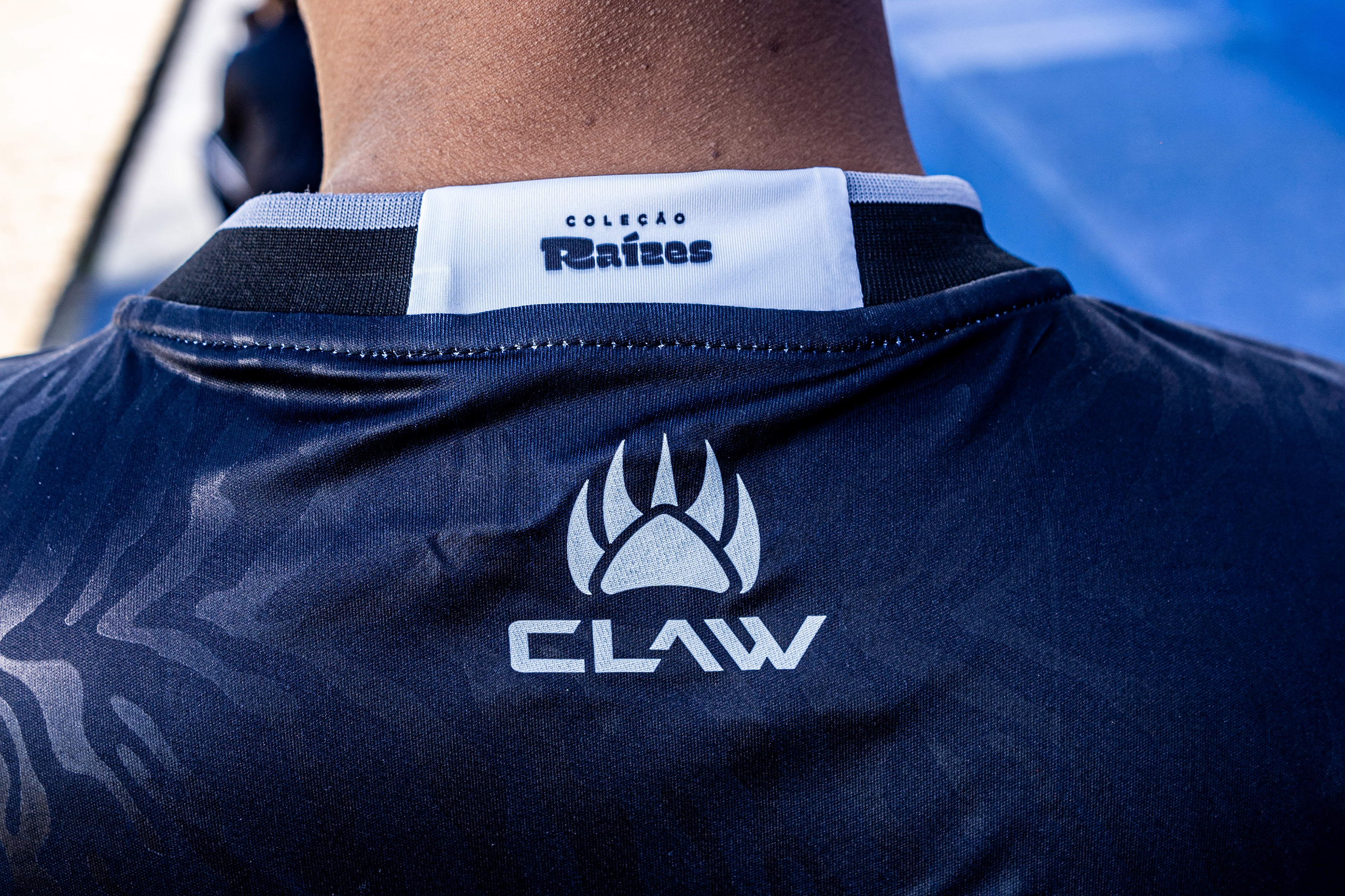
Participamos de todo o processo produtivo — do design à fábrica — para garantir que a essência do clube fosse sentida em cada costura. O conceito é amarrado por três pilares fundamentais, onde cada peça representa uma de nossas raízes: a Identidade (o torcedor), a Vila do Povo (o solo) e o Tigre da Vila (o gol).
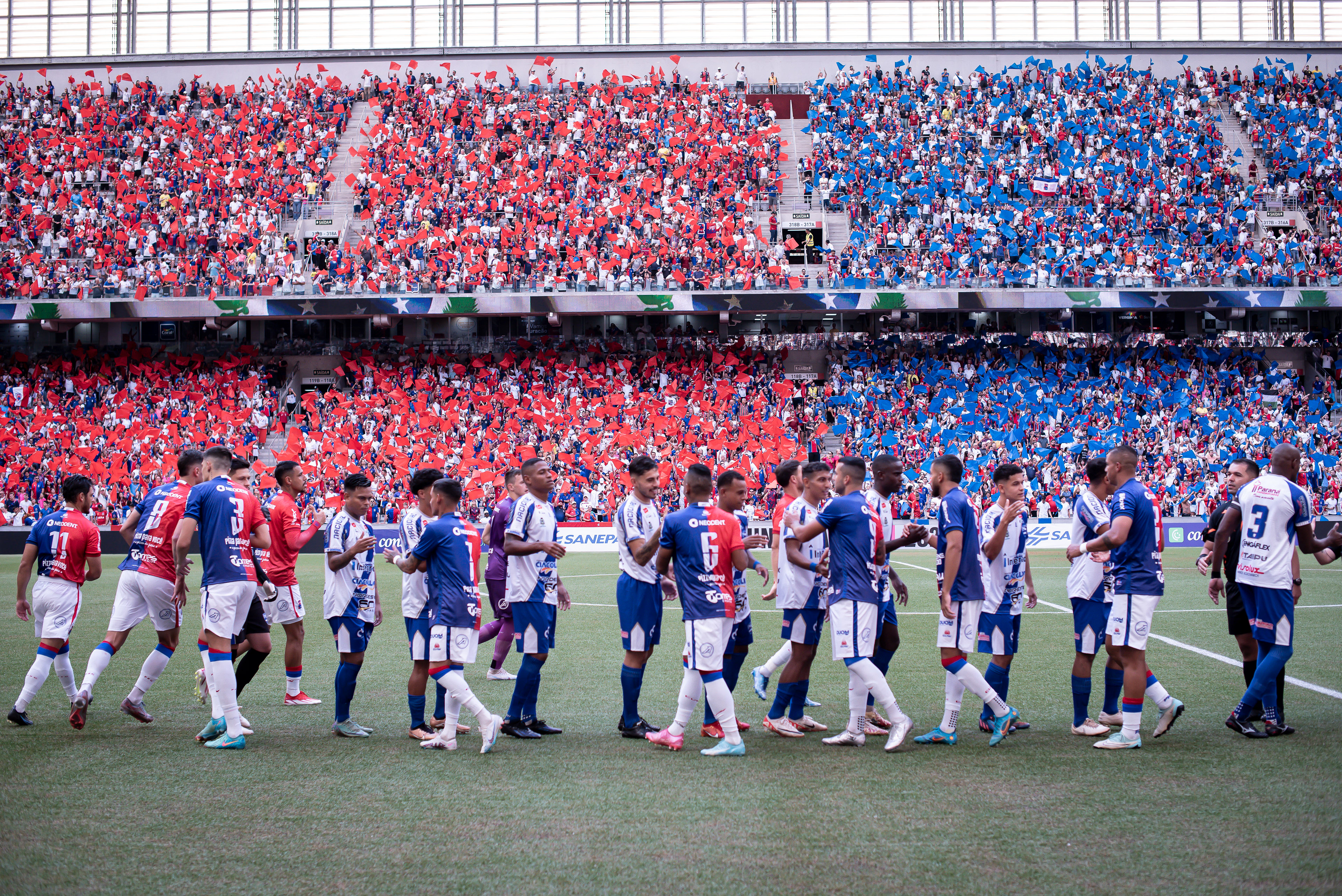
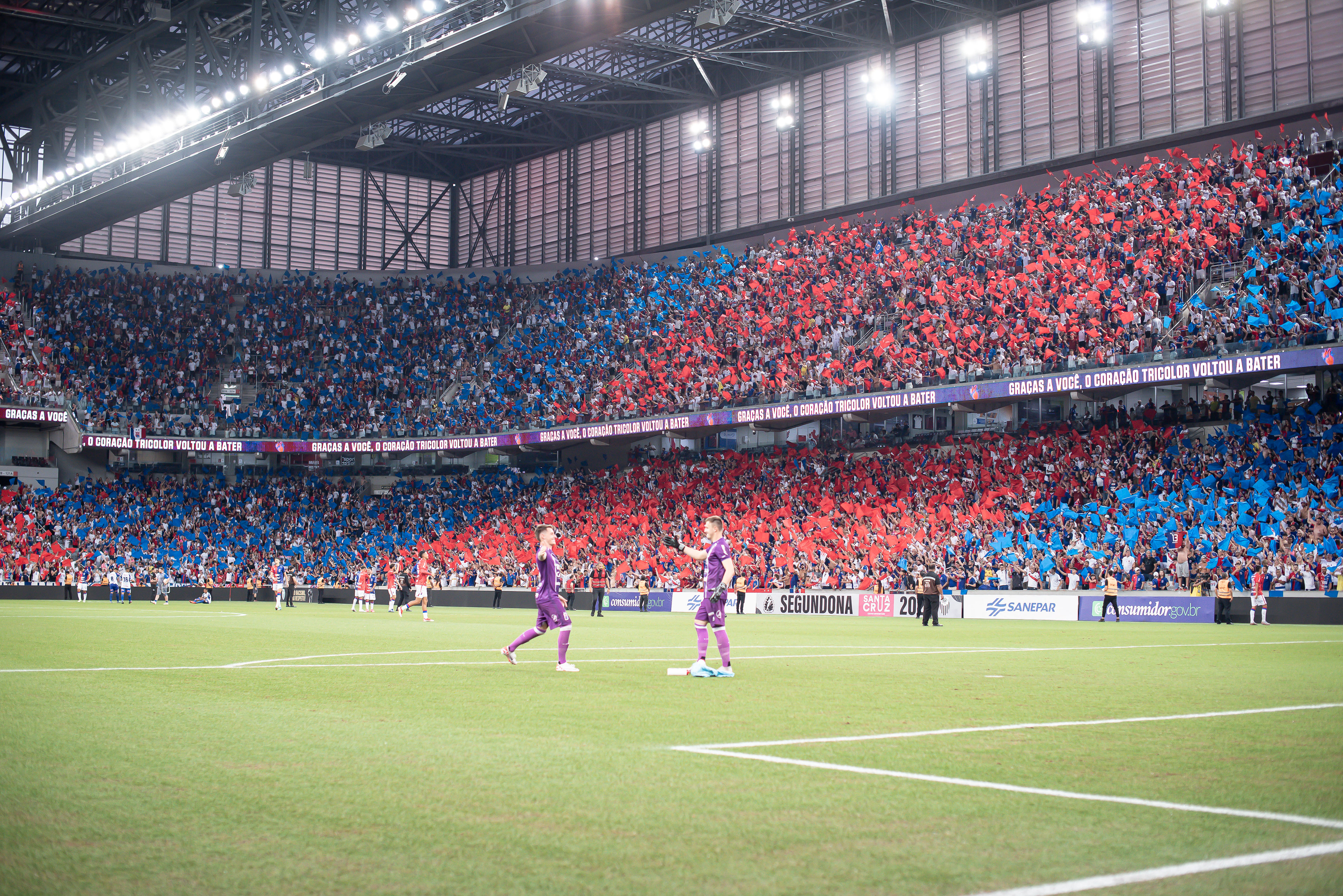
Spoiler: Deu certo! As peças foram um sucesso absoluto de vendas e a torcida, motivada pela campanha "Choque PRC", abraçou a causa: lotou os três estádios de Curitiba e conduziu o time de volta ao acesso, tudo isso enquanto a equipe vestia em campo estes exatos mantos.
EN:
The need to start over forced us to go back to the beginning.
Paraná Clube is a traditional Brazilian football club based in Curitiba, founded in 1989 from the merger of historic local teams. Known for its strong working-class identity and passionate supporters, the club has built a deep cultural connection with its community.
Despite being a massive institution, the club was coming off a disastrous season, failing to return to the elite of state football. The atmosphere was one of rebuilding, and to rebuild, nothing makes more sense than returning to our origins to understand who we are before taking the next step.
Our mission when designing the 2024 kits was to restore the fans' pride through their own history.
Thus, the Raízes (Roots) collection was born.
We participated in the entire production process — from design to the factory floor — to ensure the club's essence was felt in every stitch. The concept is bound by three fundamental pillars, where each piece represents one of our roots: Identity (the fans), The People's Village (the soil), and Tiger of the Village (the goal).
Spoiler alert: It worked! The kits were a massive sales success and the fans, motivated by the "Choque PRC" campaign, embraced the cause: they packed the three stadiums in Curitiba and pushed the team to promotion, all while the squad wore these very kits on the pitch.

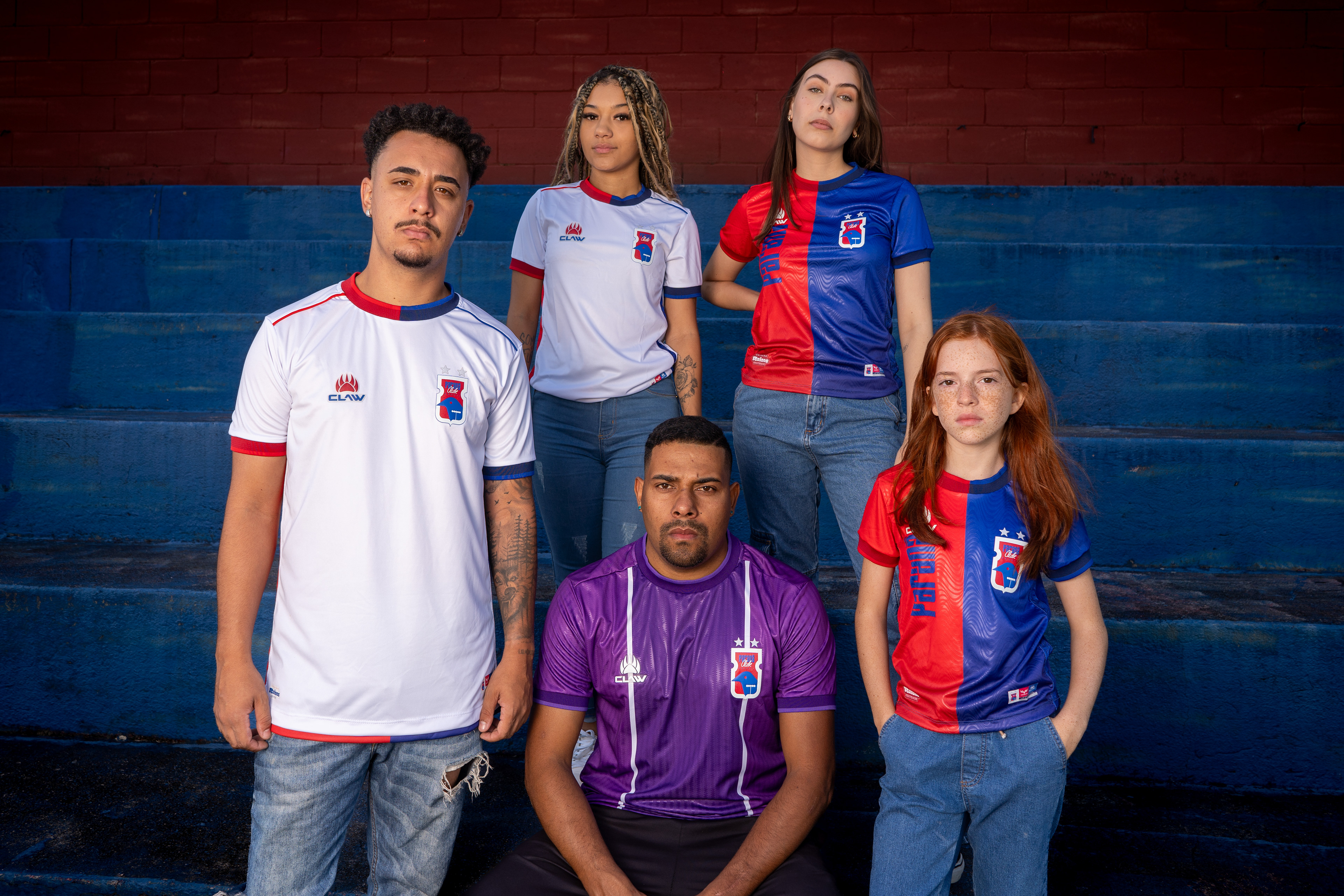
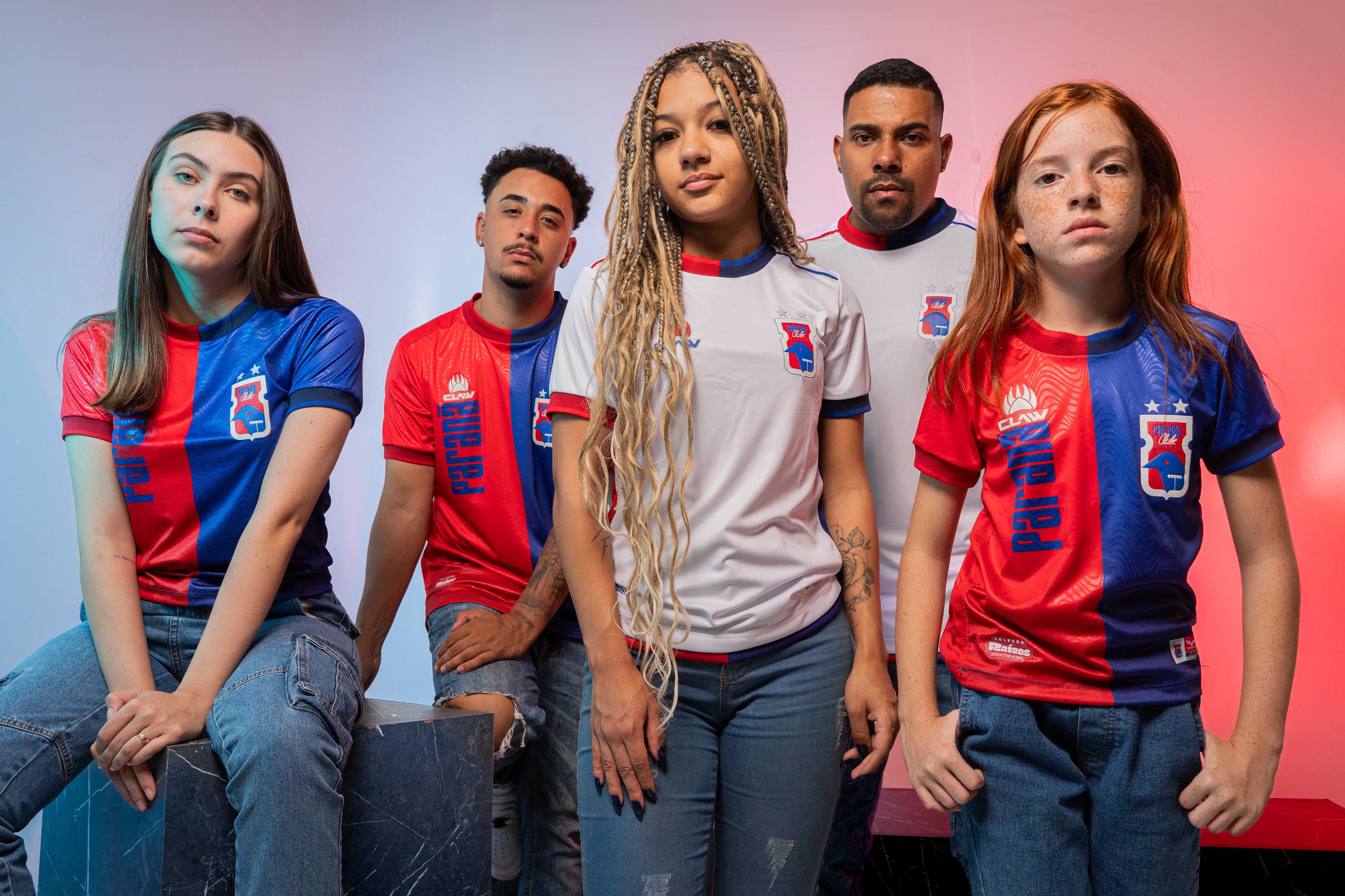
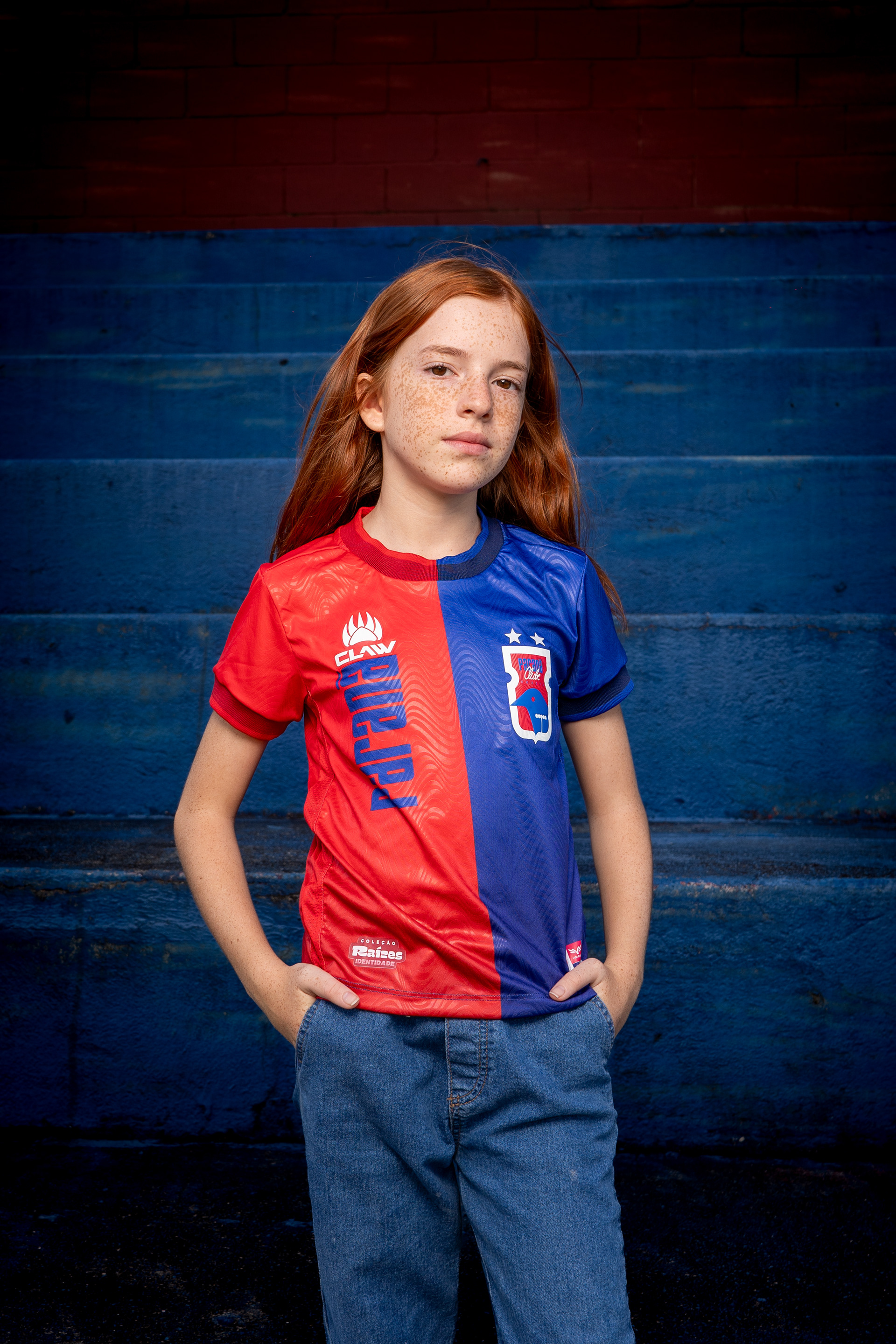
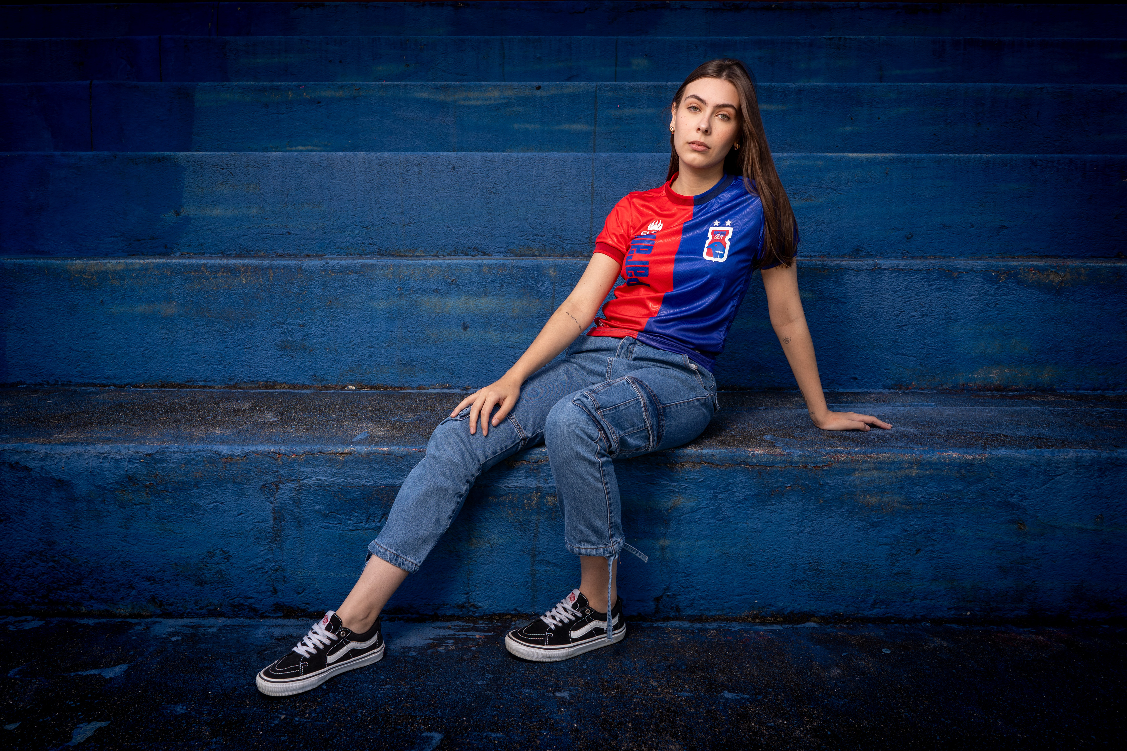
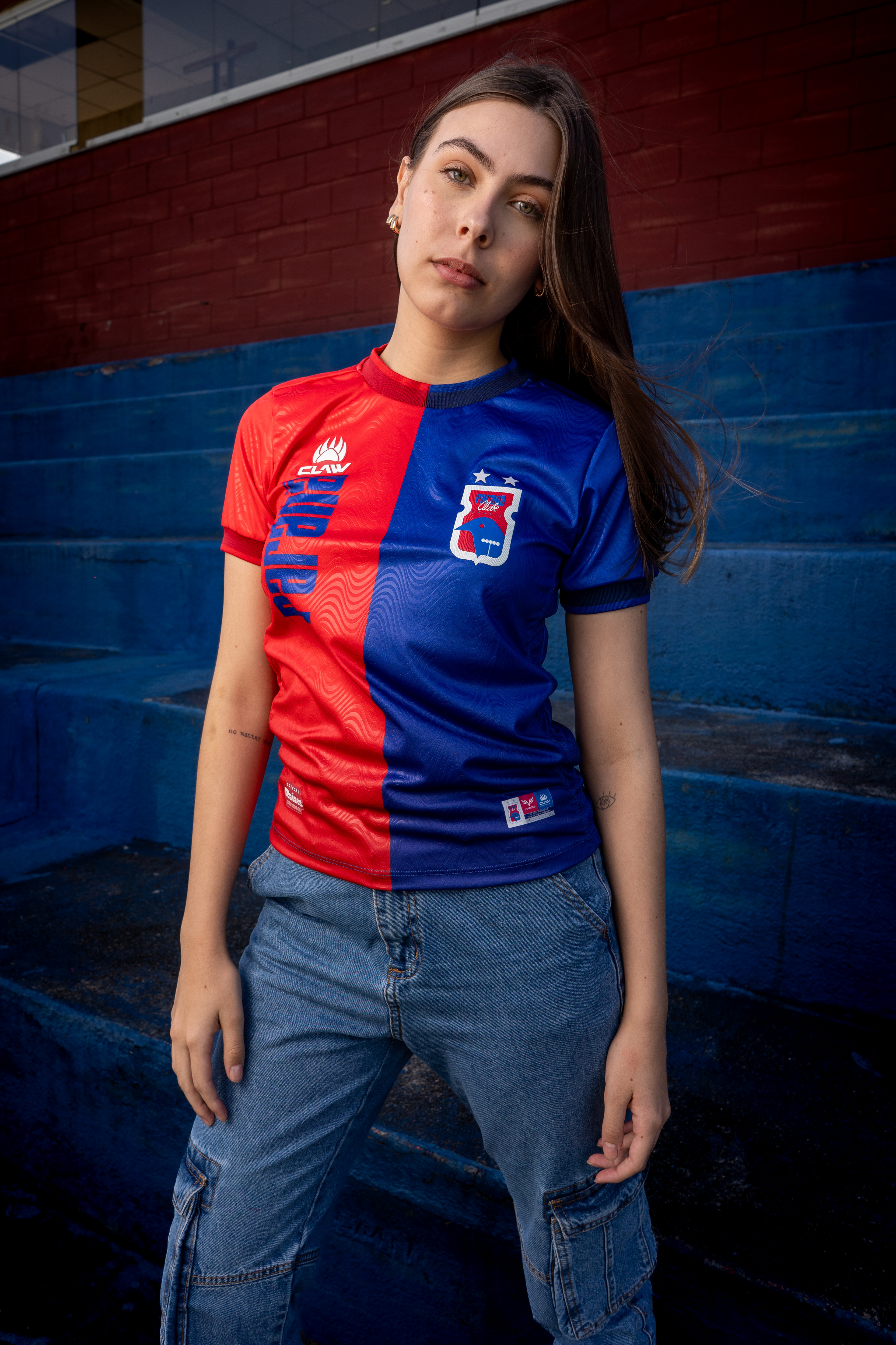
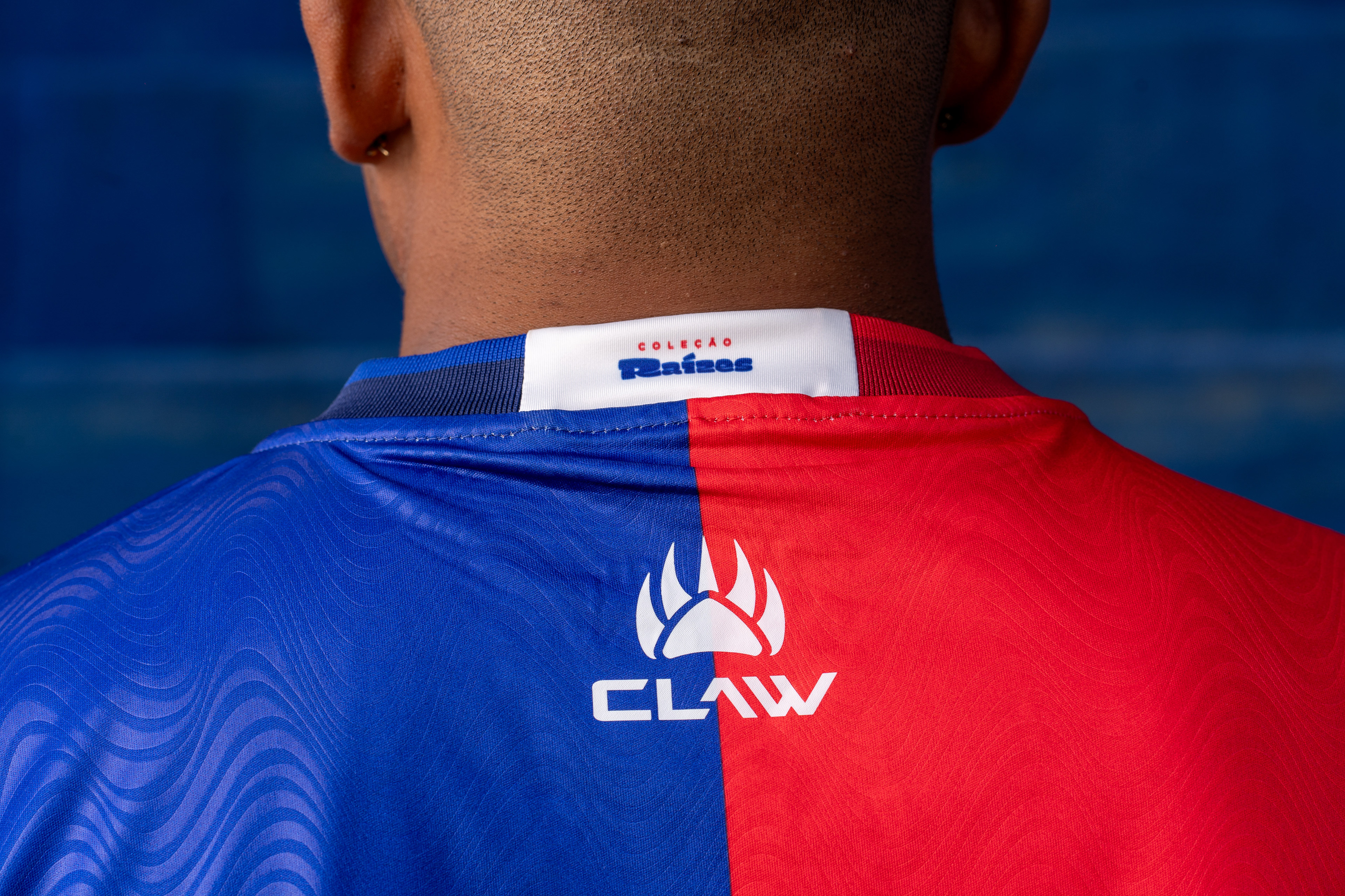
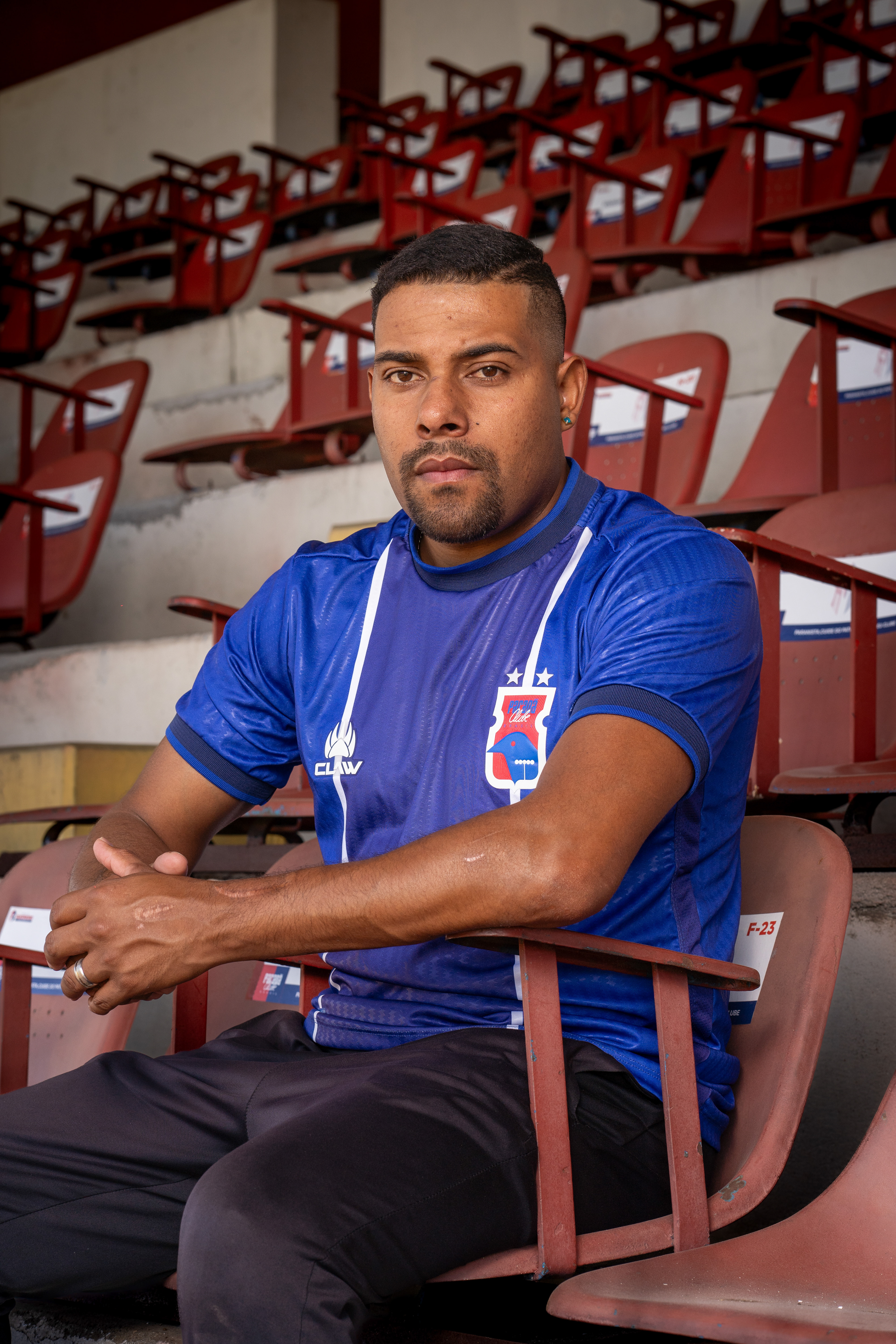
Identidade: A Raiz do Sentimento | Identity (Home Kit)
PT:
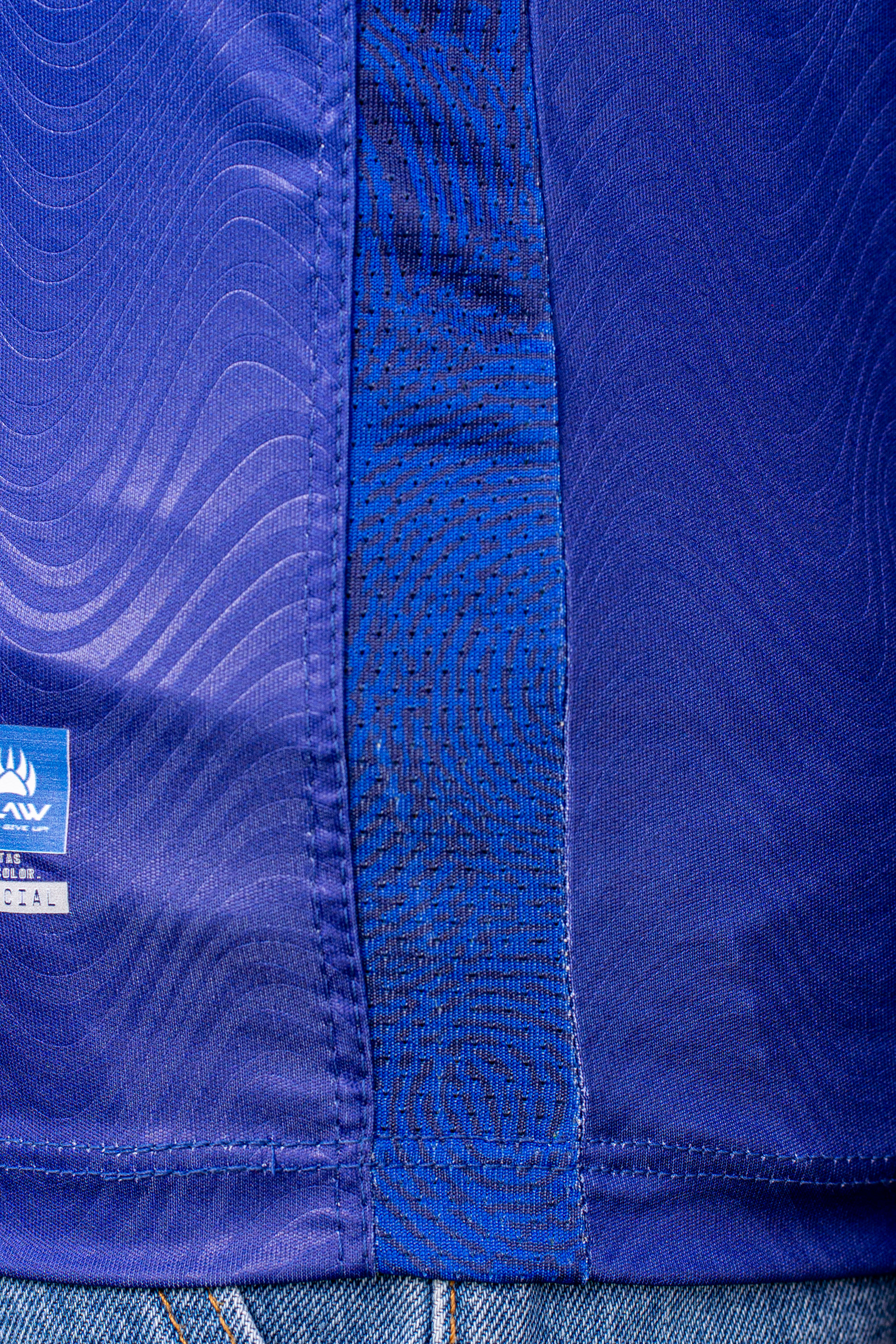
A primeira camisa celebra a força da nossa torcida, a raiz mais profunda do Paraná Clube. Trazendo o tradicional meio a meio em azul e vermelho, ela é um manifesto de paixão.
Para tornar essa conexão literal, propusemos uma ação onde os próprios torcedores foram ao clube deixar suas impressões digitais. Captamos essas marcas únicas e as transformamos na padronagem exclusiva que estampa as faixas laterais da camisa, simbolizando a ligação íntima e intangível entre a instituição e as arquibancadas.
Completando o design, a inscrição "PARANÁ" na vertical evoca a nostalgia da primeira camisa da história do clube — um retorno direto às raízes. A estética é valorizada por um leve degradê e por detalhes na gola e nas barras em tons mais escuros. Além disso, o próprio tecido recebe uma textura orgânica, conectando-se visualmente com o conceito da impressão digital. É a grande representação do torcedor paranista, aquele que enfrenta as adversidades sem nunca desistir do seu amor pelo Tricolor da Vila.
EN:
The first jersey is a celebration of the strength of our fans, the deepest root of Paraná Clube. Featuring the traditional half-blue, half-red design, it is a true manifesto of passion.
To make this connection literal, we proposed an initiative where the fans themselves went to the club to leave their fingerprints. We captured these unique marks and transformed them into the exclusive pattern that adorns the side panels of the jersey, symbolizing the intimate and intangible bond between the institution and the stands.
Completing the design, the vertical "PARANÁ" inscription evokes the nostalgia of the first jersey in the club's history — a direct return to our roots. The aesthetic is enhanced by a subtle gradient and darker tones on the collar and cuffs. Furthermore, the fabric itself features an organic texture, visually connecting with the fingerprint concept. It is the ultimate representation of the Paraná fan, the one who faces adversity without ever giving up their love for the Tricolor da Vila

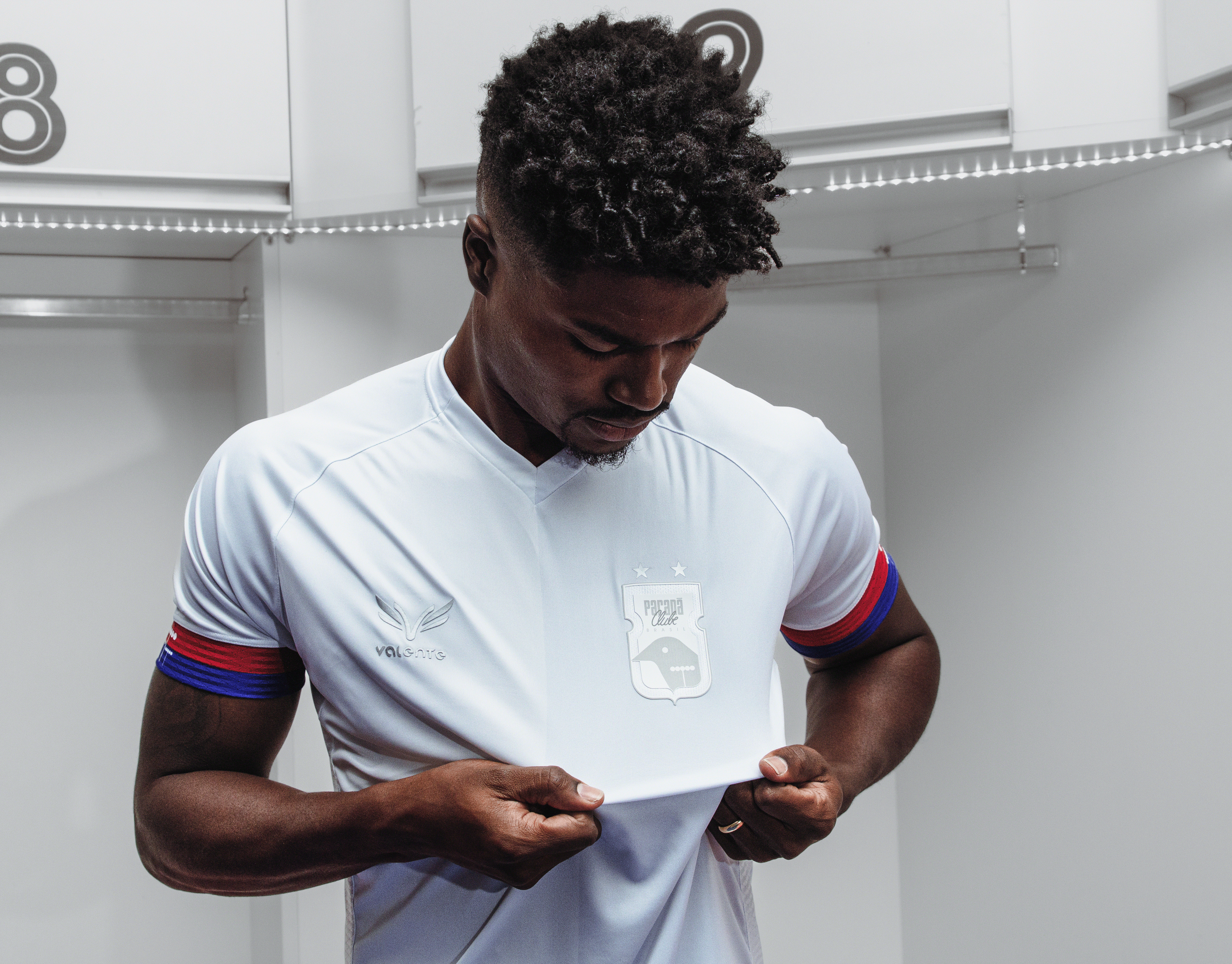
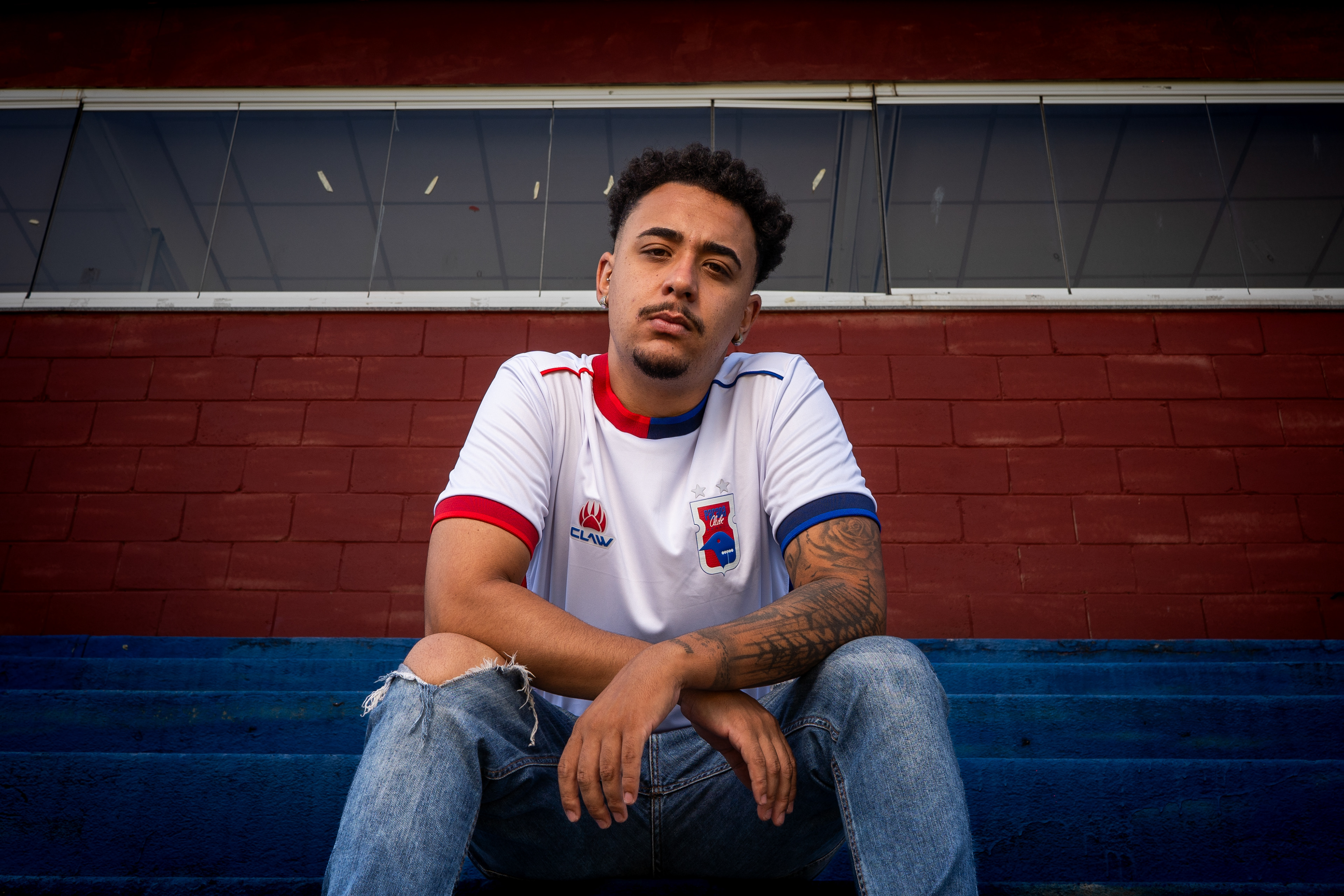
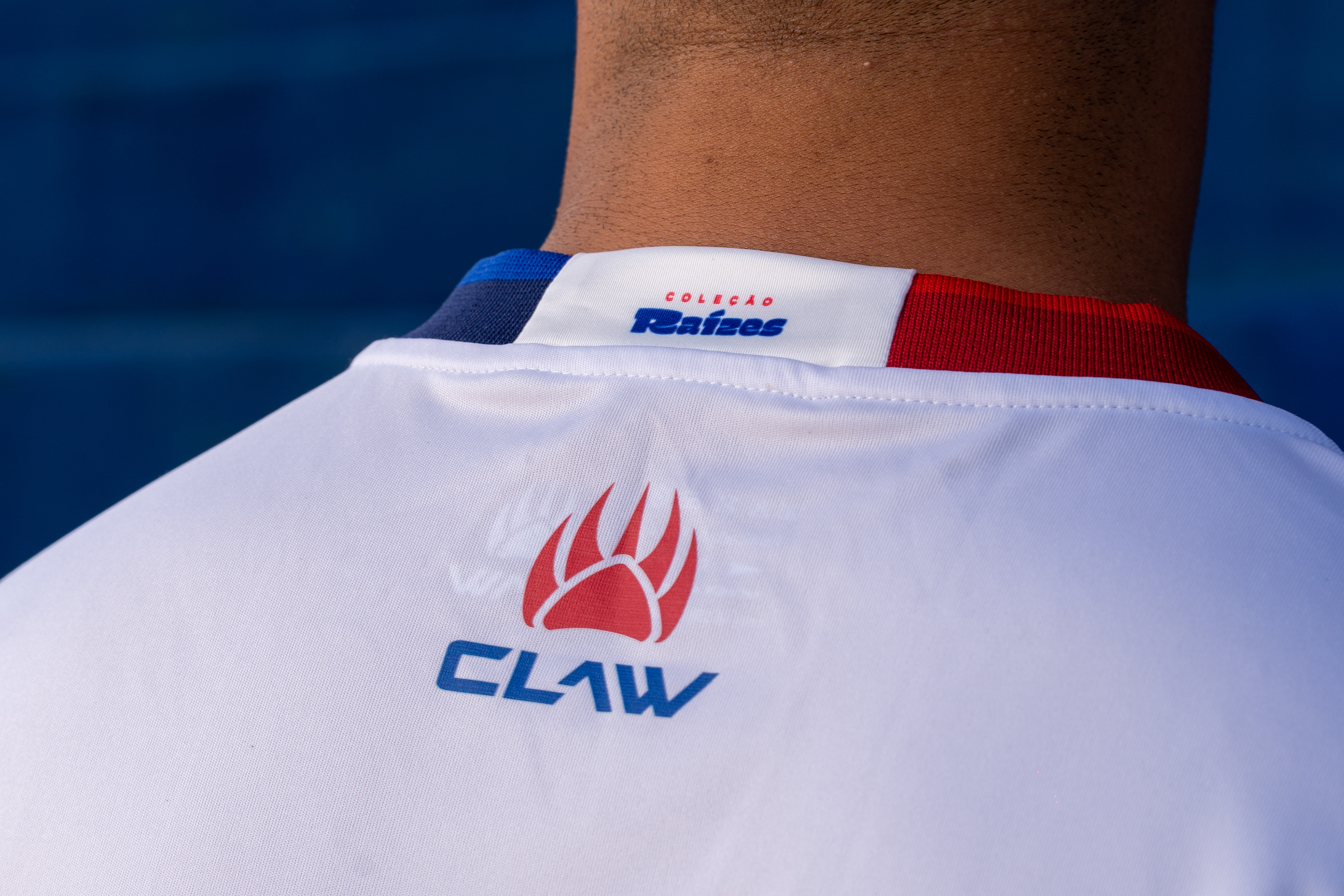
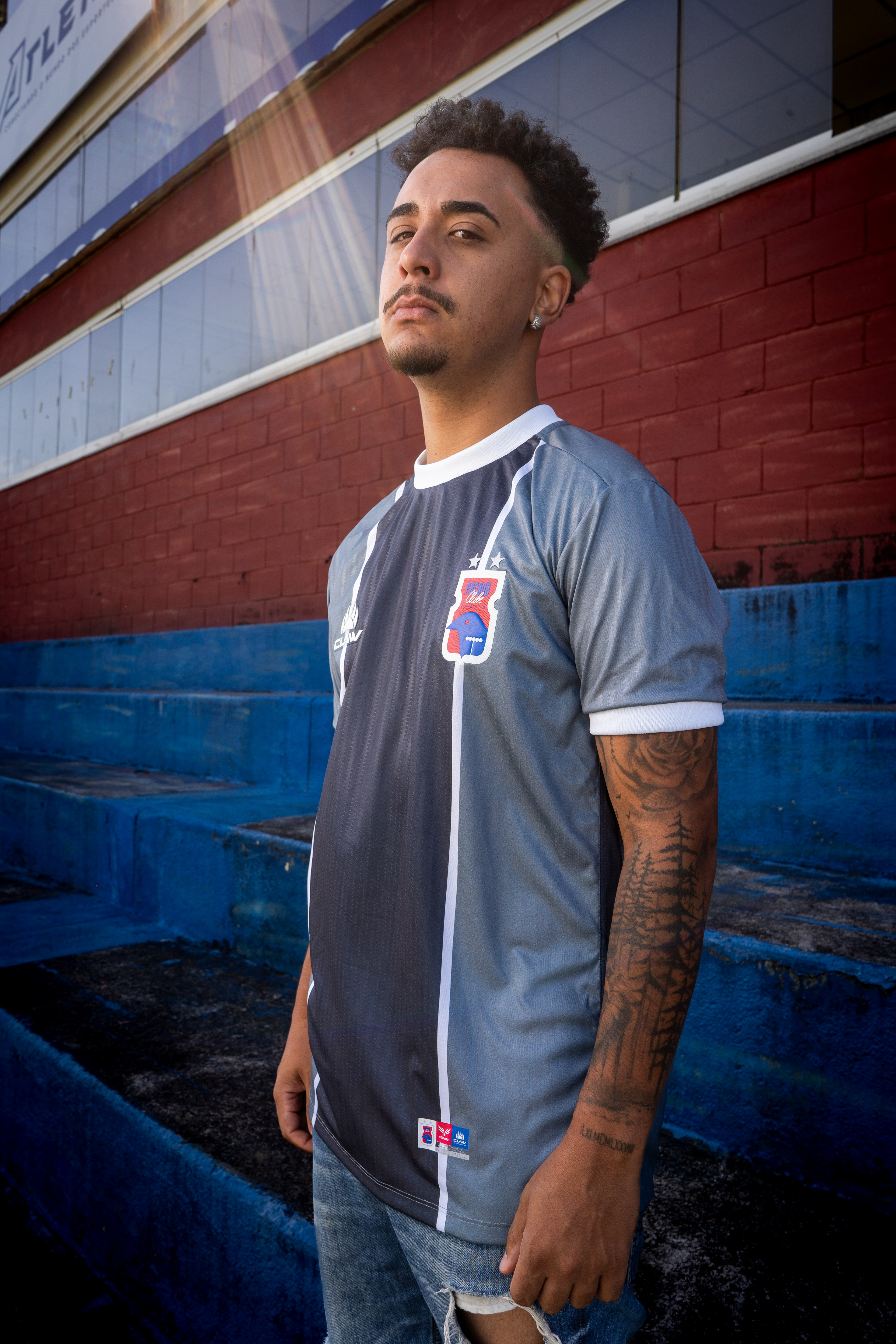
Vila do Povo: O Solo da Emoção | The People's Village (Away Kit)
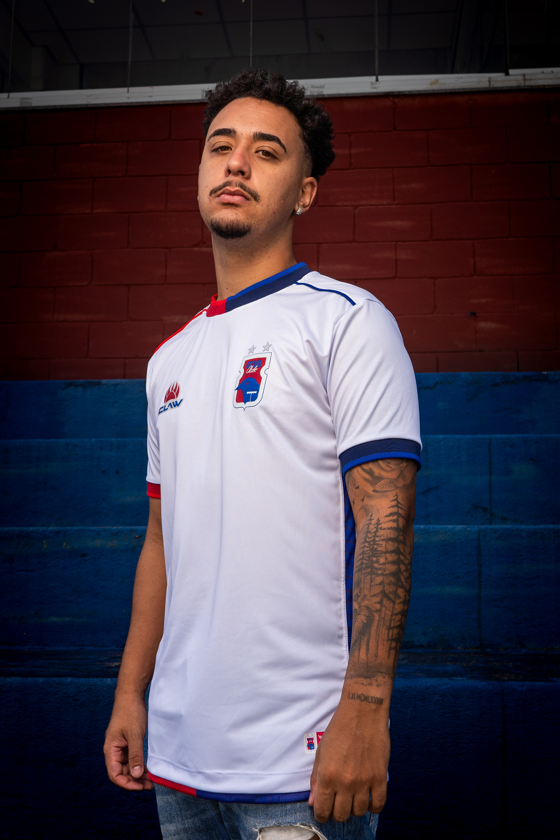
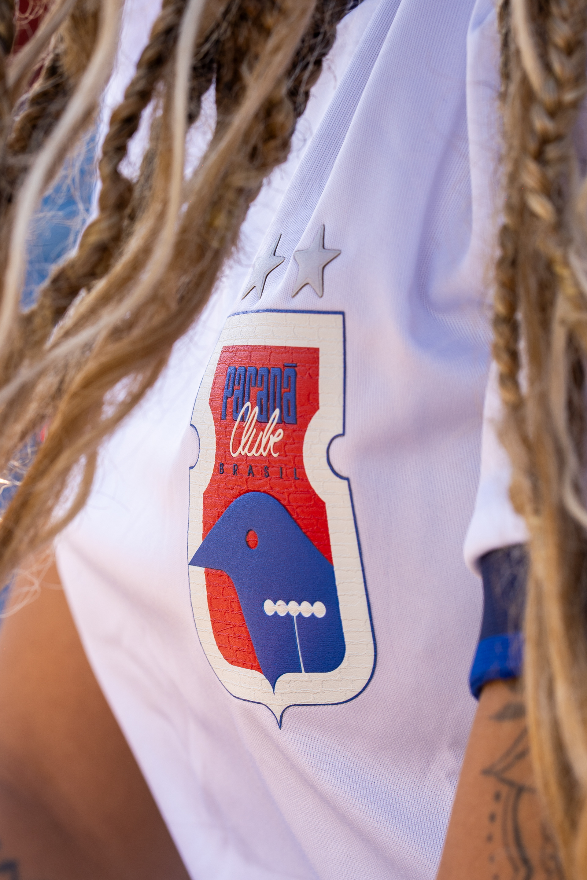
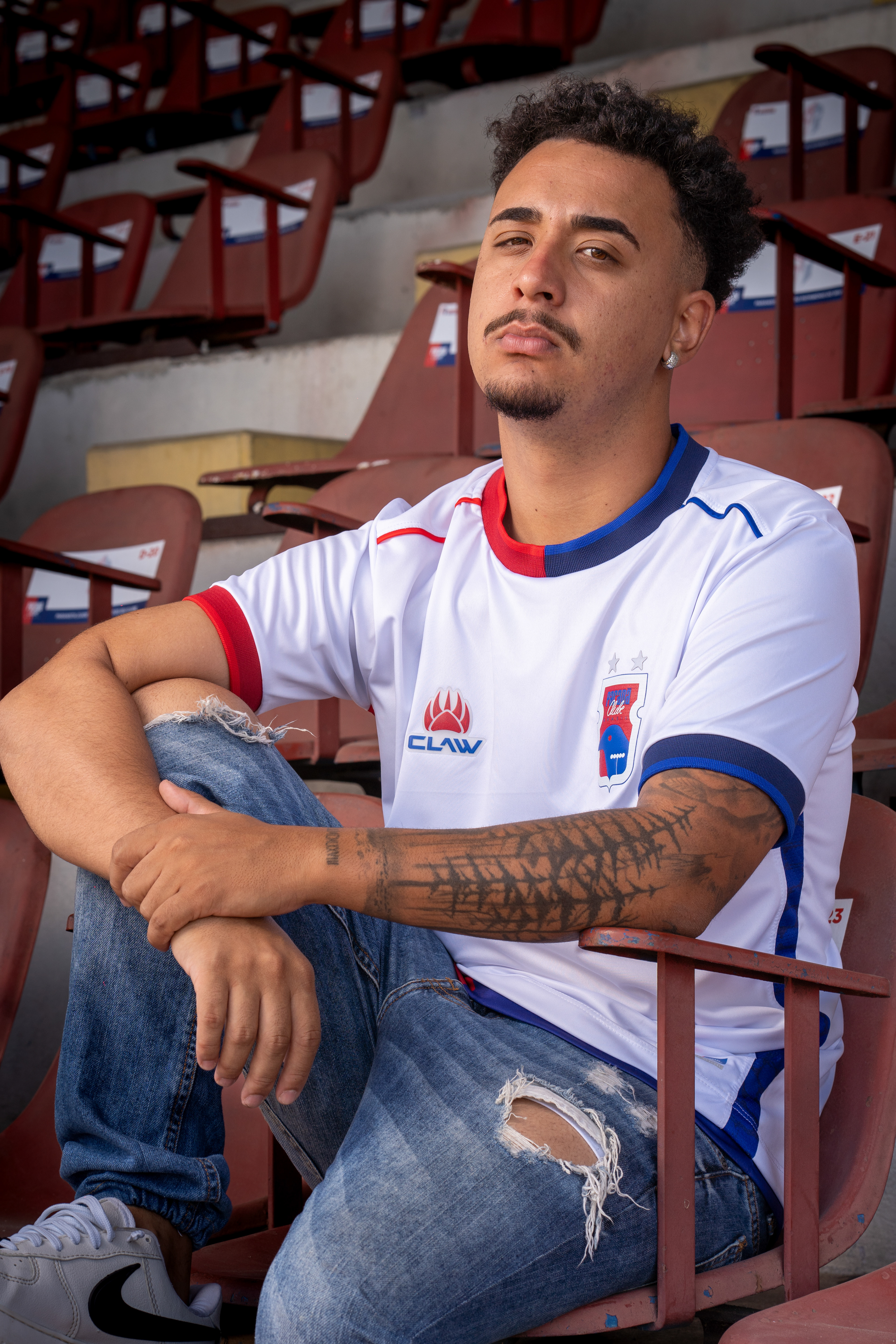
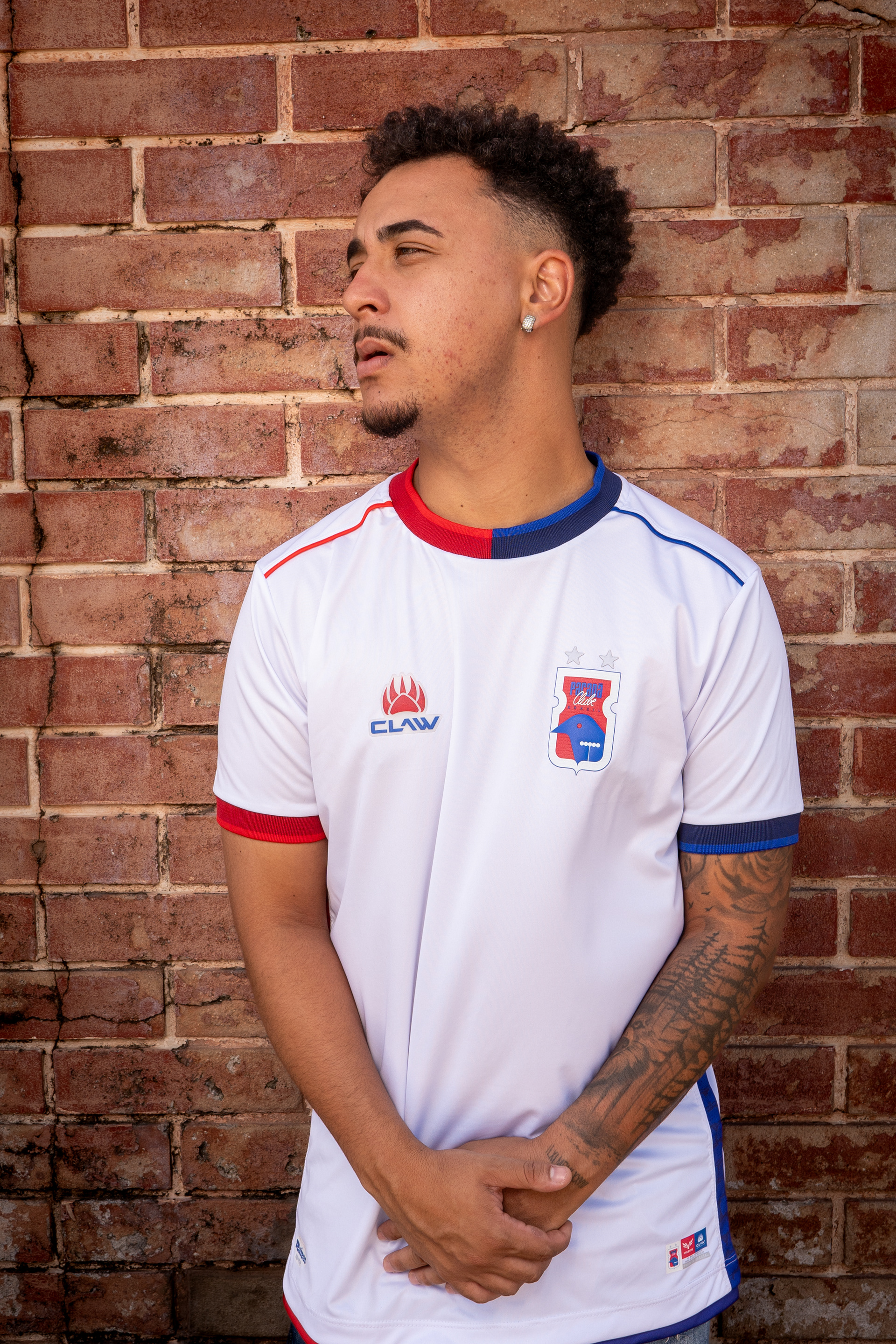
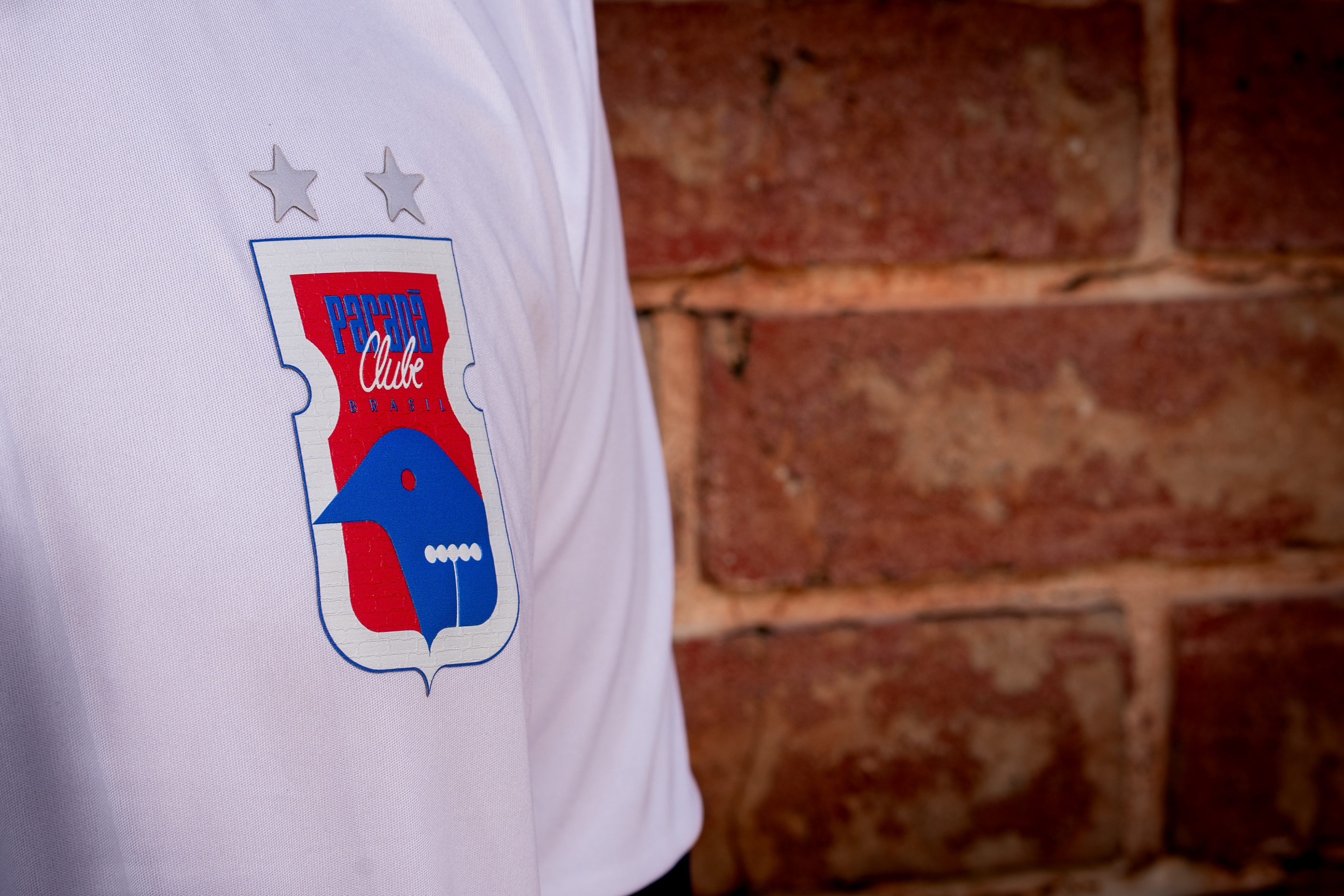
PT: A segunda camisa da linha "Raízes" presta homenagem à Vila Capanema, o solo sagrado onde nossas raízes crescem e a paixão floresce. Totalmente branca, com detalhes pontuais em azul e vermelho, a peça é um pedaço literal da história do clube.
Para criar a textura presente no escudo e nas faixas laterais, fizemos uma referência direta aos tradicionais tijolos aparentes localizados atrás da Arquibancada Social do nosso estádio. Eles estão lá desde a sua construção, em 1947, visando sediar jogos da Copa do Mundo de 1950.
Esse detalhe evoca a solidez e a tradição da casa da nação paranista — e o olhar mais atento poderá identificar esses mesmos tijolos compondo o cenário de algumas fotos oficiais desta coleção. É a representação do lugar onde o paranismo é vivido e compartilhado por toda a torcida.
EN: The second jersey from the "Roots" line pays homage to Vila Capanema, the sacred soil where our roots grow and passion flourishes. Completely white with specific blue and red details, the piece is a literal piece of the club's history.
To create the texture featured on the crest and side panels, we made a direct reference to the traditional exposed bricks located behind the stadium's Social Stands. These bricks have been there since its construction in 1947, built to host matches for the 1950 World Cup.
This detail evokes the solidity and tradition of the home of the Paraná nation — and the attentive eye will be able to spot these very bricks setting the scene in some of the official photos of this collection. It is the representation of the place where paranismo (the passion for the club) is lived and shared by the entire fanbase.


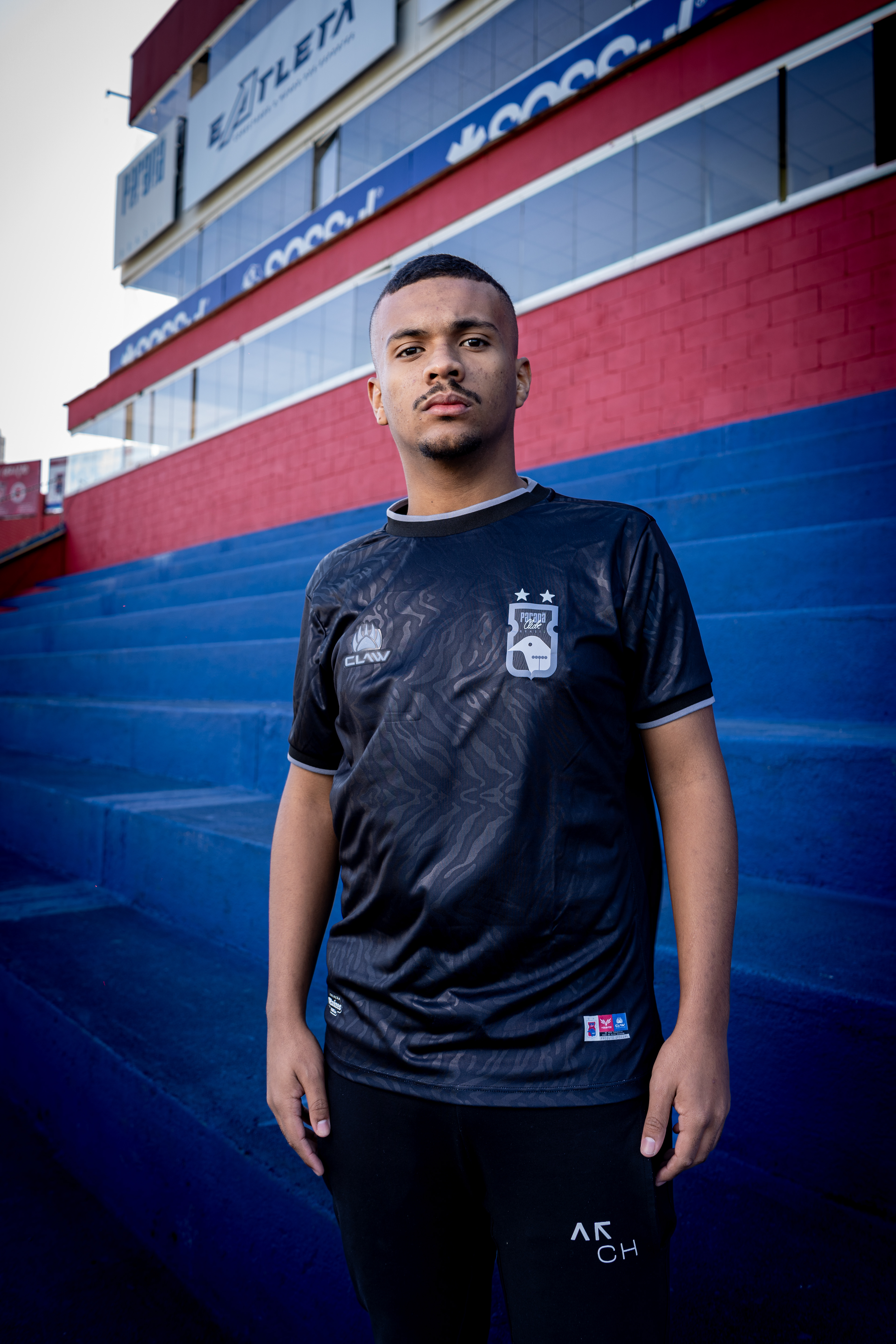
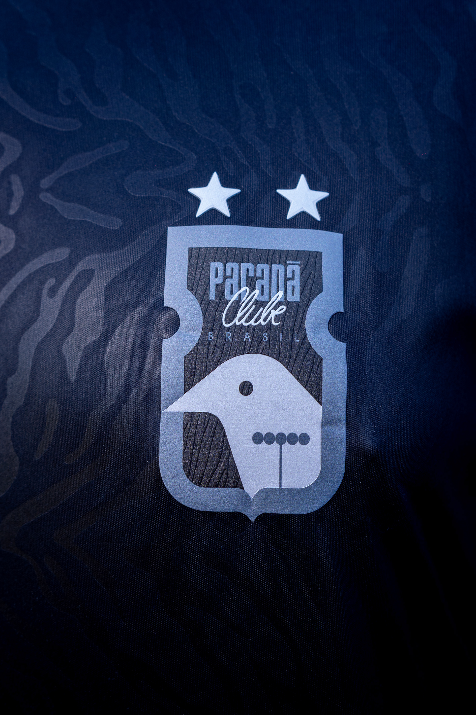
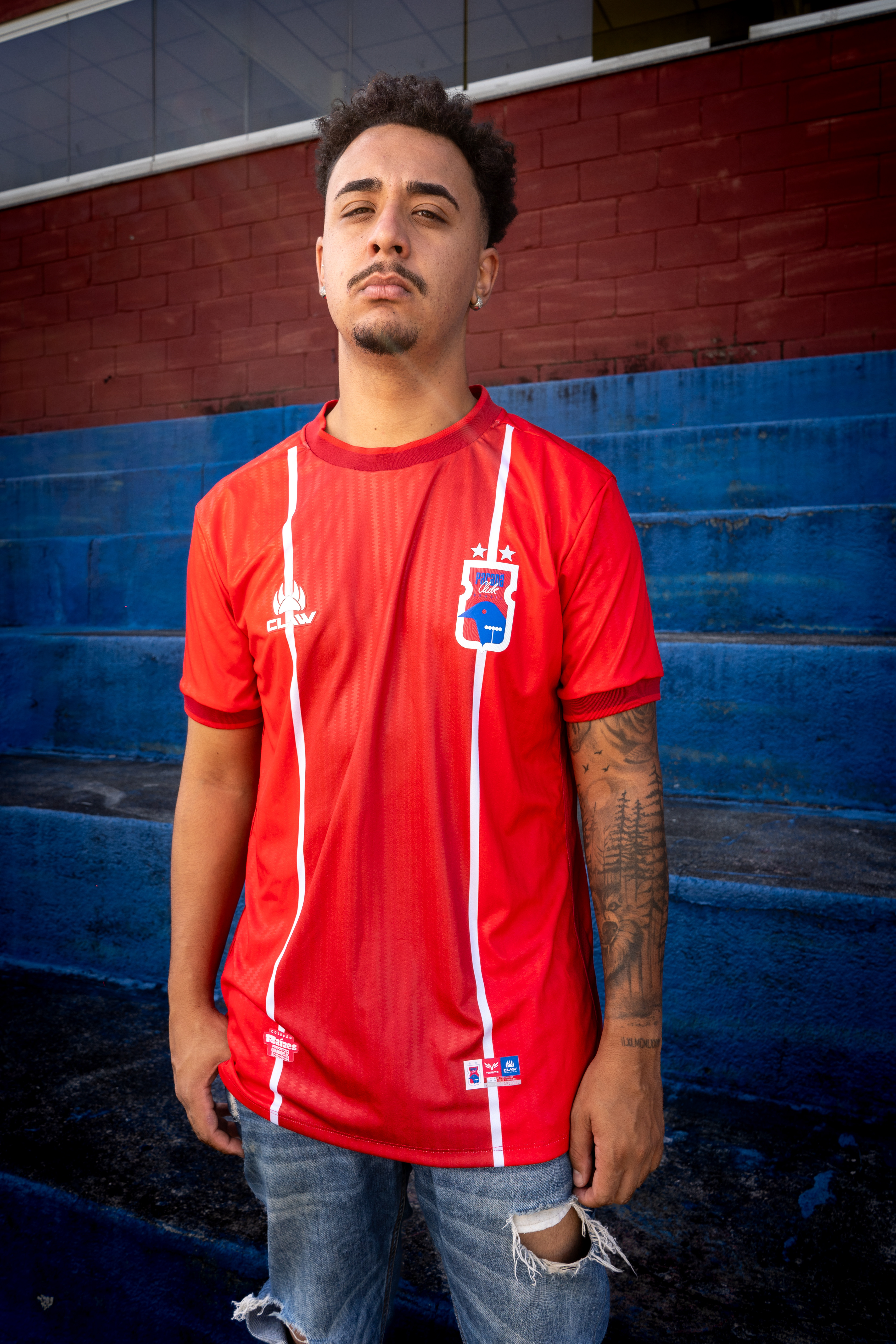
Tigre da Vila: As Raízes do Gol | Tiger of the Village (Third Kit)
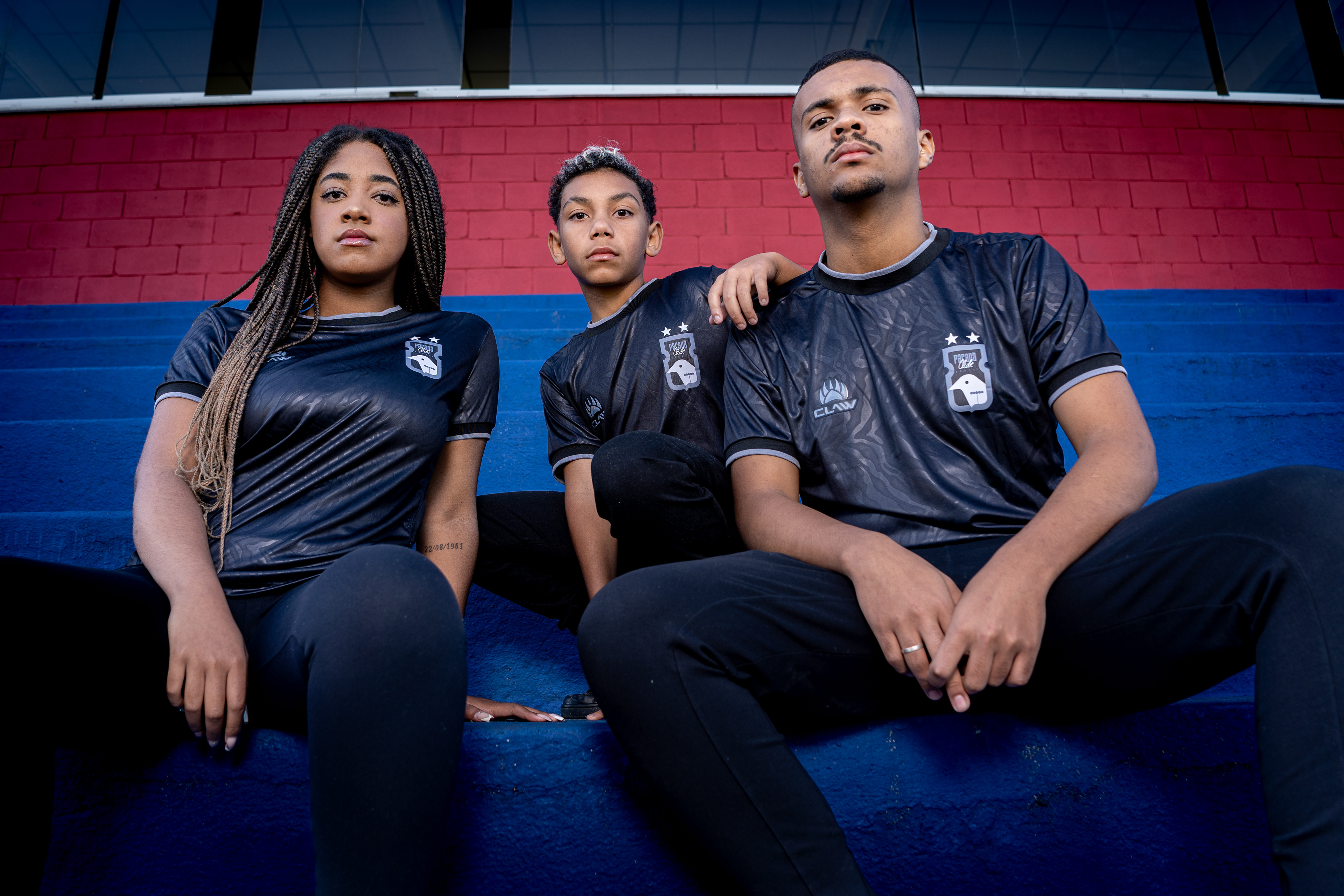
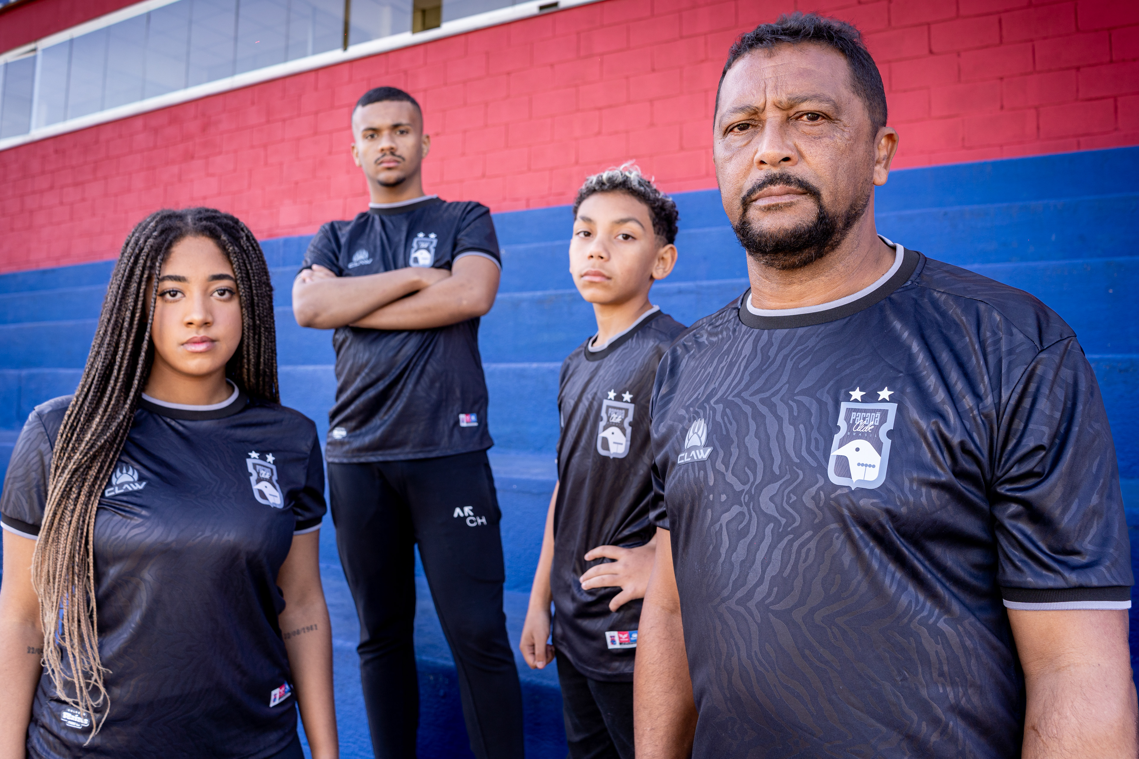
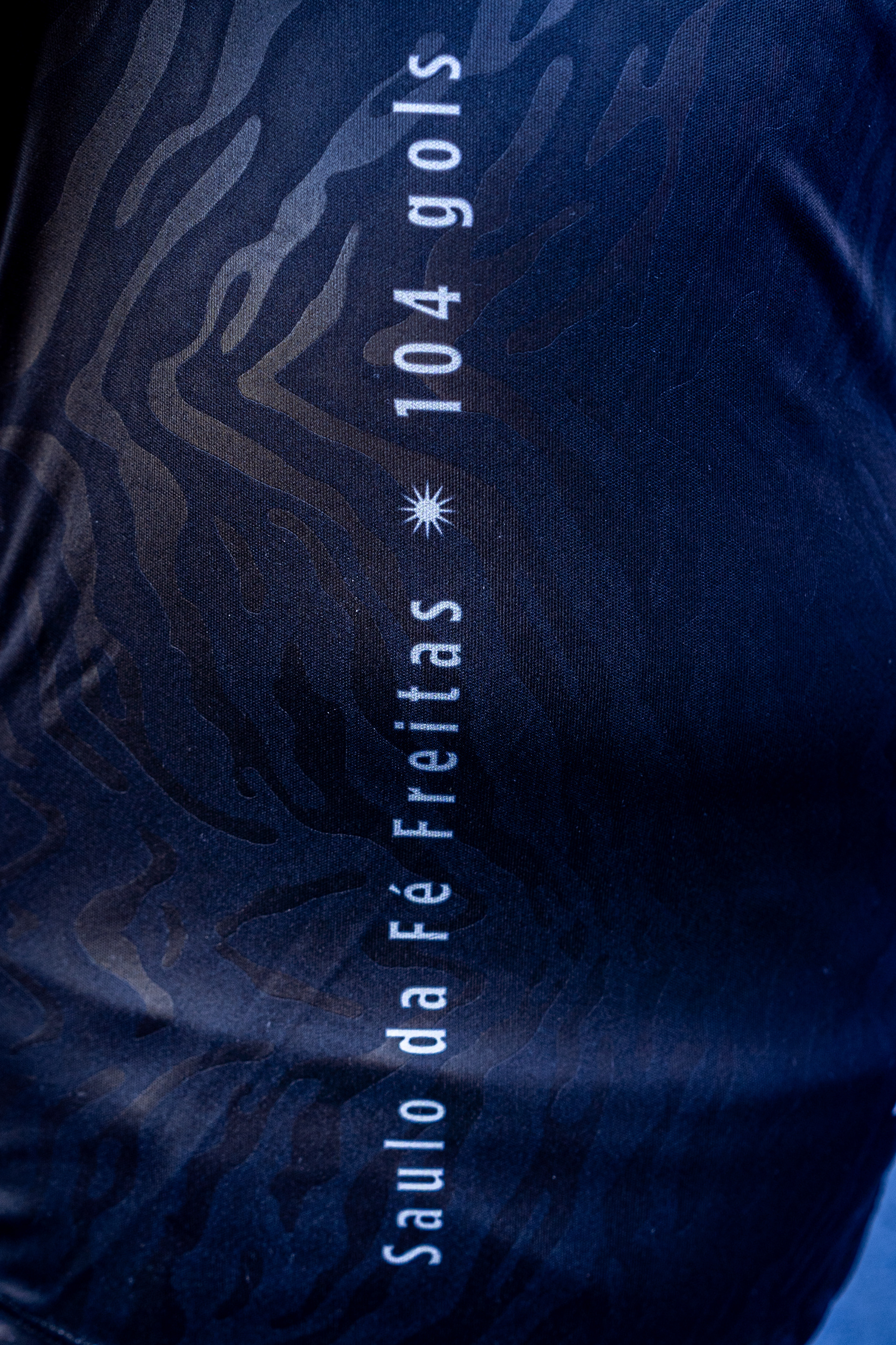
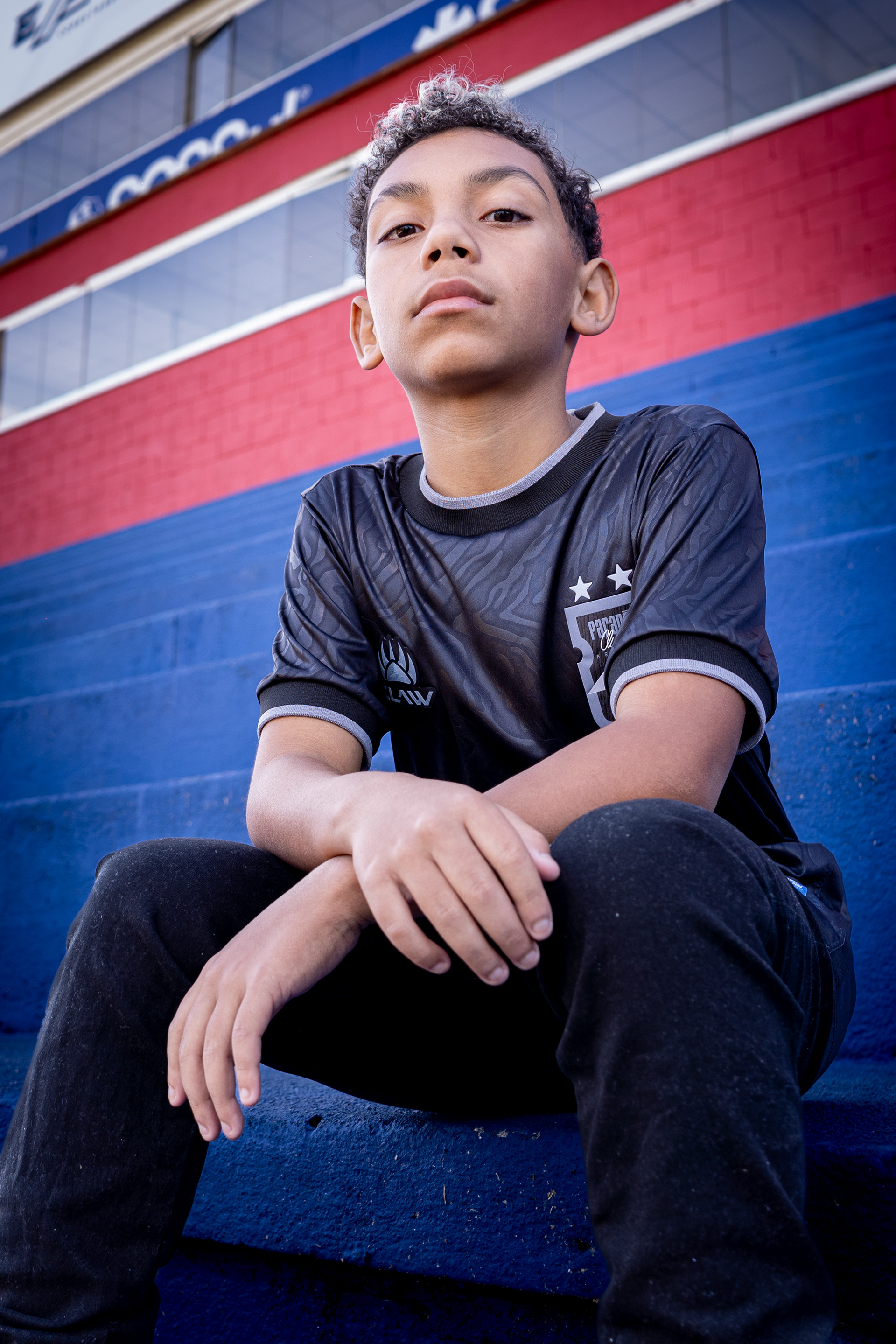
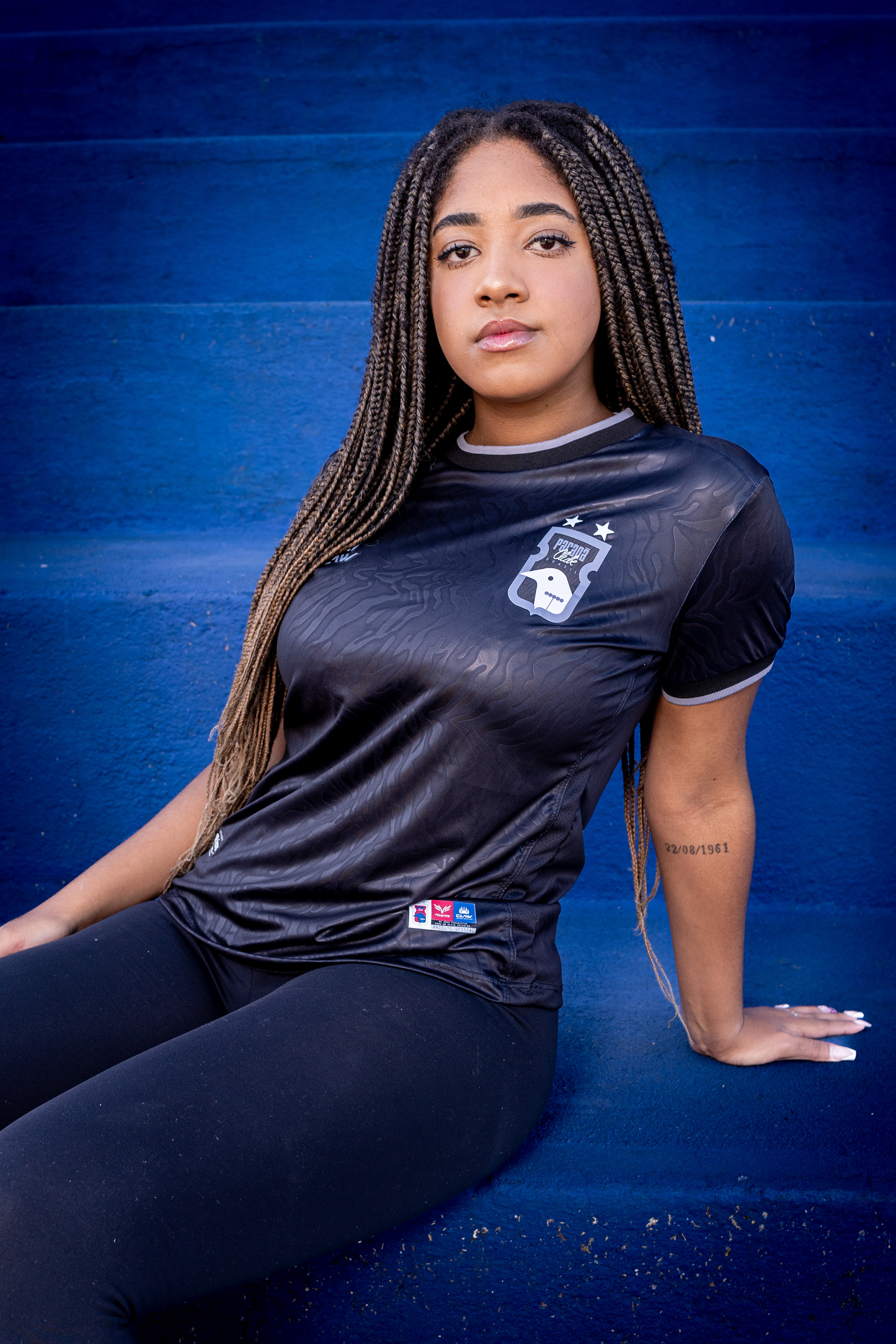
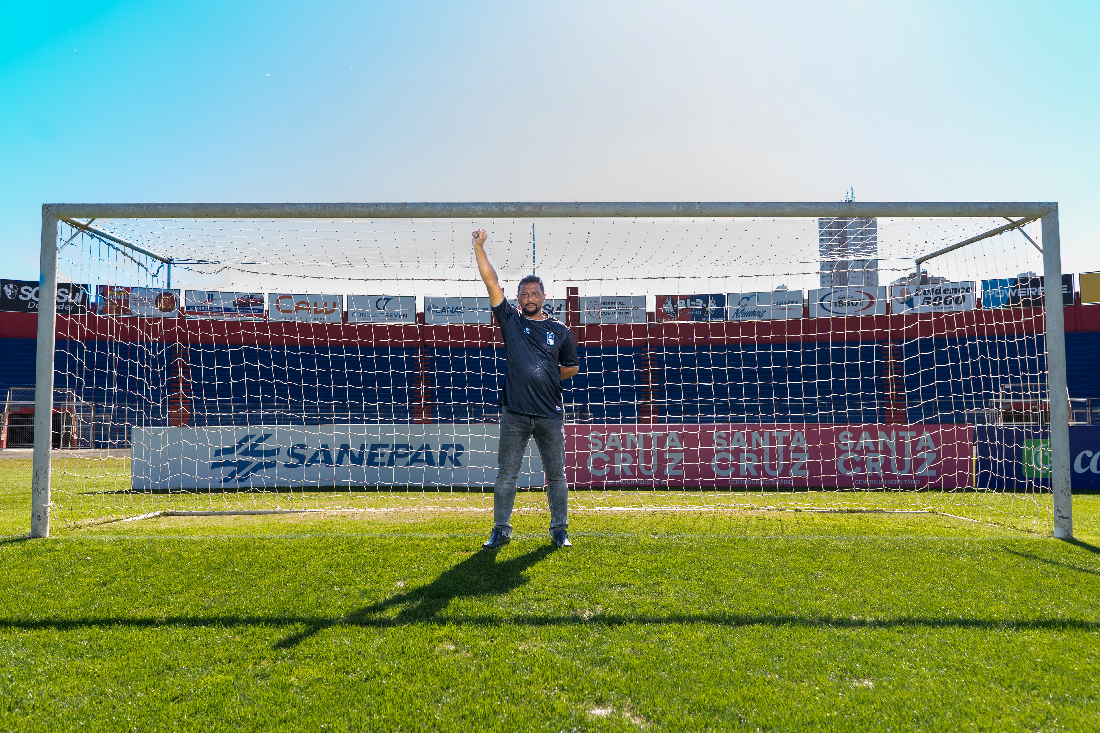
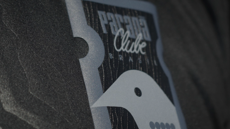
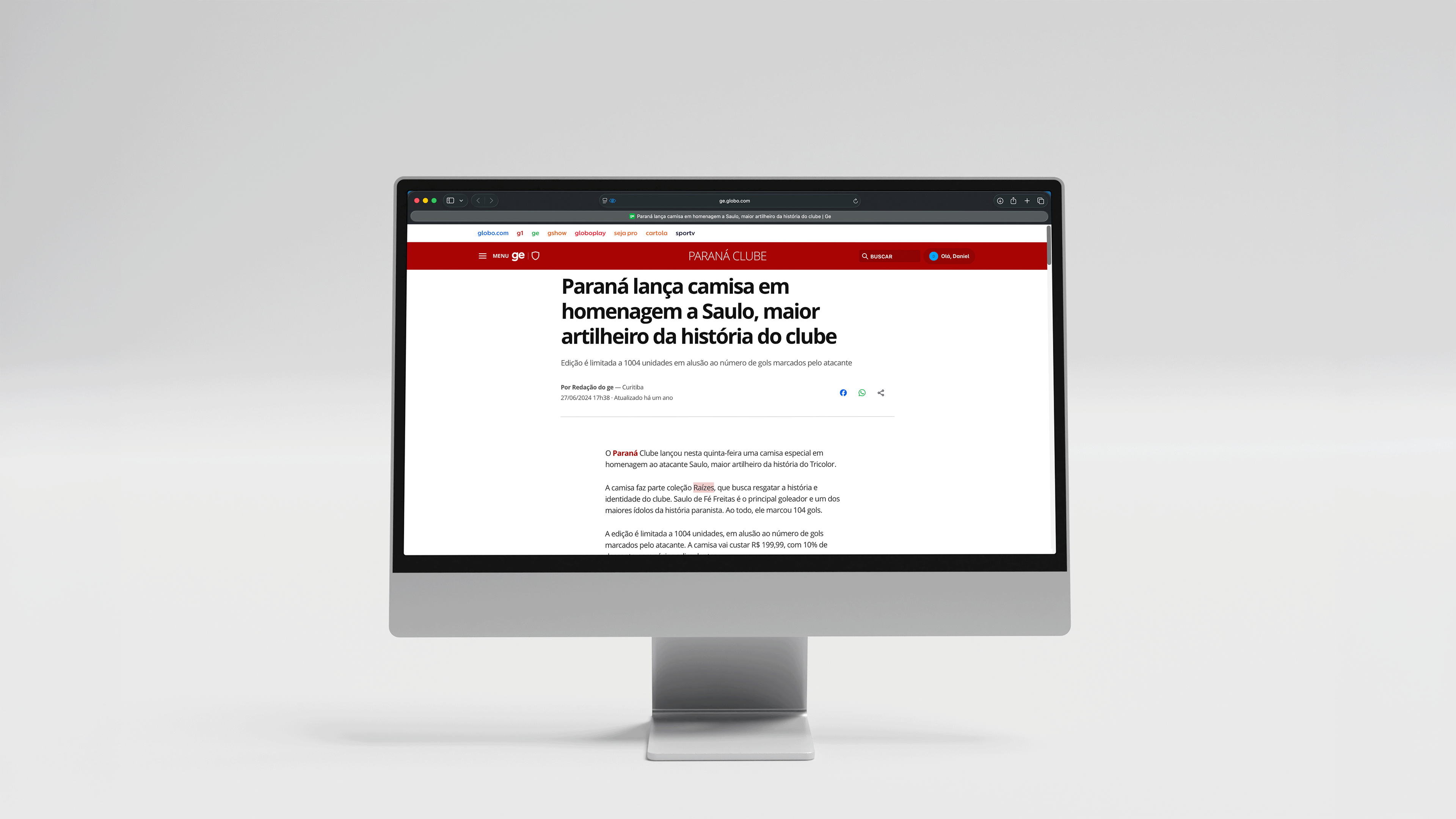
PT: A terceira camisa da linha "Raízes" homenageia Saulo, o "Tigre da Vila" e maior artilheiro da história do Paraná Clube. Ao celebrar o nosso ídolo, reverenciamos também a raiz fundamental do esporte: o gol.
Totalmente preta e com textura de listras de tigre no tecido e no escudo , a peça é uma afirmação de força. Para eternizar esse legado, o manto traz a inscrição "Saulo da Fé Freitas * 104 gols". É a representação perfeita de quem sempre esteve no topo da cadeia alimentar da grande área.
Ao romper com a tradição e adotar o preto na camisa de linha e no escudo, o projeto transcende o futebol. Ela se torna um reconhecimento histórico aos torcedores negros, base de sustentação do clube , levantando de forma clara a bandeira da luta antirracista.
EN: The third jersey from the "Roots" line pays tribute to Saulo, the "Tigre da Vila" (Tiger of the Village) and the greatest top scorer in Paraná Clube's history. By celebrating our idol, we also revere the fundamental root of the sport: the goal.
Completely black with a tiger stripe texture on the fabric and crest , the piece is a statement of strength. To immortalize this legacy, the kit features a special inscription: "Saulo da Fé Freitas * 104 gols" (104 goals). It is the perfect representation of someone who has always been at the top of the food chain in the penalty box.
By breaking with tradition and adopting black for the outfield player's jersey and crest, the project transcends football. It becomes a historical acknowledgment of the Black fans, the sustaining foundation of the club , while clearly raising the flag for the anti-racist struggle
Check:


O Clímax: O Manifesto "Tigre da Vila" | The Climax: The "Tigre da Vila" Manifesto
PT: O lançamento do terceiro manto exigia algo impactante. Afinal, pela primeira vez na história, o Paraná Clube adotava a cor preta em seu escudo e em uma camisa de linha. Para marcar essa quebra de tradição, criamos um manifesto.
O filme amarra o conceito de toda a coleção: resgata a origem operária da instituição, o abraço à população renegada e a reverência aos torcedores negros que formam a base de sustentação do clube e ajudaram a erguer o nosso estádio. Tudo isso culminando na homenagem definitiva ao nosso maior artilheiro, Saulo da Fé Freitas. Para esta peça, assinamos a redação, o roteiro, a direção de fotografia e a produção (asset management).
EN: The launch of the third kit demanded something impactful. After all, for the first time in its history, Paraná Clube was adopting the color black for its crest and an outfield jersey. To mark this break from tradition, we created a manifesto.
The film ties together the concept of the entire collection: it reclaims the institution's working-class origins, its embrace of the marginalized, and the reverence for the Black fans who form the foundation of the club and helped build our stadium. All of this culminating in the ultimate tribute to our greatest top scorer, Saulo da Fé Freitas. For this piece, we were responsible for the copywriting, scriptwriting, cinematography direction, and asset management.
Créditos do Vídeo | Video Credits:
Copywriting: Daniel Momm, Leandro Arruda e Vitor Salmazo
Script & Cinematography Direction: Daniel Momm e Leandro Arruda
Asset Production/Curation: Daniel Momm
Shooting & Video Editing: Brito Films
O Roteiro | The Script (Voiceover)
PT: "Em 2024, celebramos as nossas raízes. A necessidade de recomeçar nos obrigou a voltar ao início. E a raiz da nossa origem, coberta de glórias e também de muita luta, vem de um povo operário e aguerrido. É uma honra viver por um clube que abraçou a população renegada por outras associações curitibanas. E fazendo jus ao país do futebol, que tem como rei eterno um homem preto, nosso clube é privilegiado pelo fato de poder aplaudir e reverenciar um ídolo que ostenta a mesma cor de pele daqueles que construíram a Vila Capanema e toda a nossa história.
Na nossa memória, ele permanece em pé. No topo da cadeia alimentar da grande área. Olhar convicto, instinto matador, faro de gol e muita garra ao vestir as nossas cores. Hoje, celebramos o homem que mais nos deu a oportunidade de celebrar: Saulo da Fé Freitas, o Tigre da Vila.
Representa o gol. A raiz do futebol. E como em nossa história sempre acolhemos quem era deixado de fora, entendemos que o Paraná Clube é formado por todos os seus torcedores. O Paraná Clube é vermelho, azul e branco. O Paraná Clube também é preto. No peito, na raça, honrando as nossas cores. Todas elas. Coleção Raízes. Tigre da Vila."
EN: "In 2024, we celebrate our roots. The need to start over forced us to go back to the beginning. And the root of our origin, covered in glory and also in great struggle, comes from a fierce, working-class people. It is an honor to live for a club that embraced the population marginalized by other local associations. And doing justice to the country of football, which has a Black man as its eternal king, our club is privileged to be able to applaud and revere an idol who bears the same skin color as those who built Vila Capanema and our entire history.
In our memory, he remains standing. At the top of the food chain of the penalty box. A convinced look, a killer instinct, a nose for goal, and immense grit when wearing our colors. Today, we celebrate the man who gave us the most opportunities to celebrate: Saulo da Fé Freitas, the Tiger of the Village.
He represents the goal. The root of football. And since throughout our history we have always welcomed those left outside, we understand that Paraná Clube is made up of all its fans. Paraná Clube is red, blue, and white. Paraná Clube is also black. With heart, with grit, honoring our colors. All of them. Roots Collection. Tiger of the Village."


Na Mídia | Press
PT: O peso histórico da Coleção Raízes, somado à quebra de paradigma do escudo preto no uniforme "Tigre da Vila", transcendeu as arquibancadas e virou notícia nos principais portais esportivos do país, comprovando o impacto cultural do projeto.
EN: Press & Repercussion | The Launch Impact The historical weight of the "Roots" Collection, combined with the paradigm shift of the black crest on the "Tiger of the Village" kit, transcended the stands and made headlines in the country's major sports portals, proving the cultural impact of the project.
CHECK:

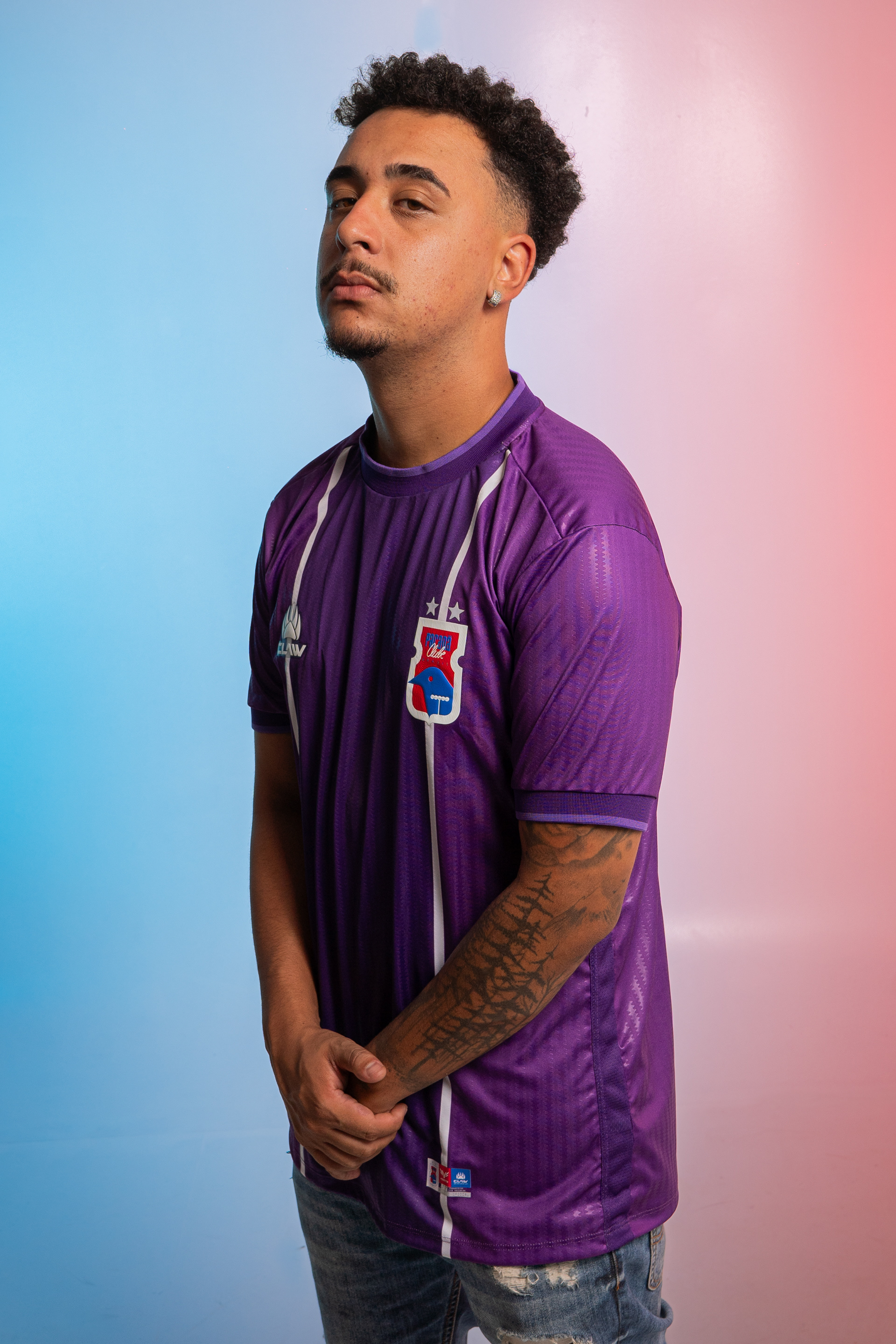
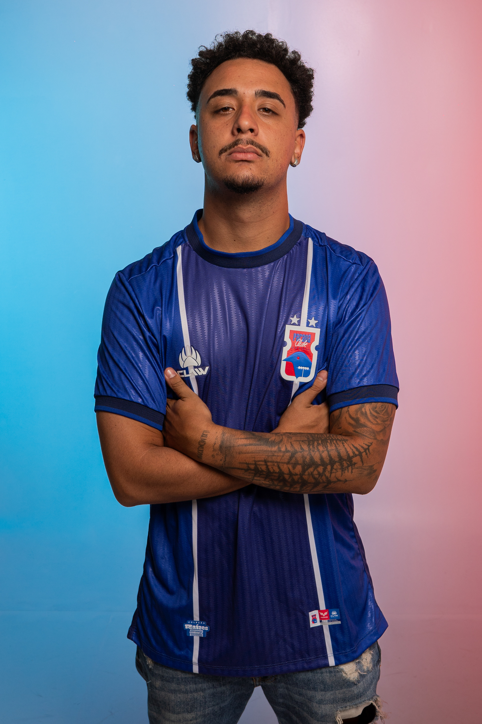
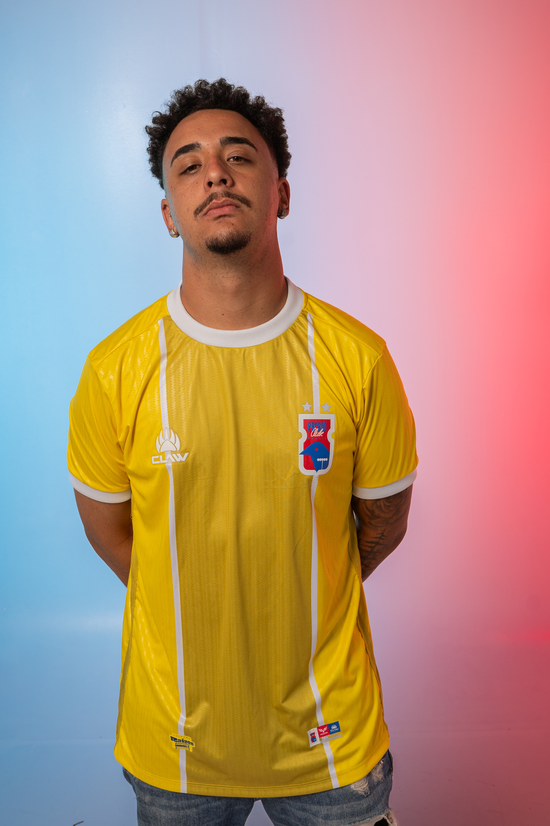
Guardiões: As Raízes da História | Guardians (Goalkeeper Kits)
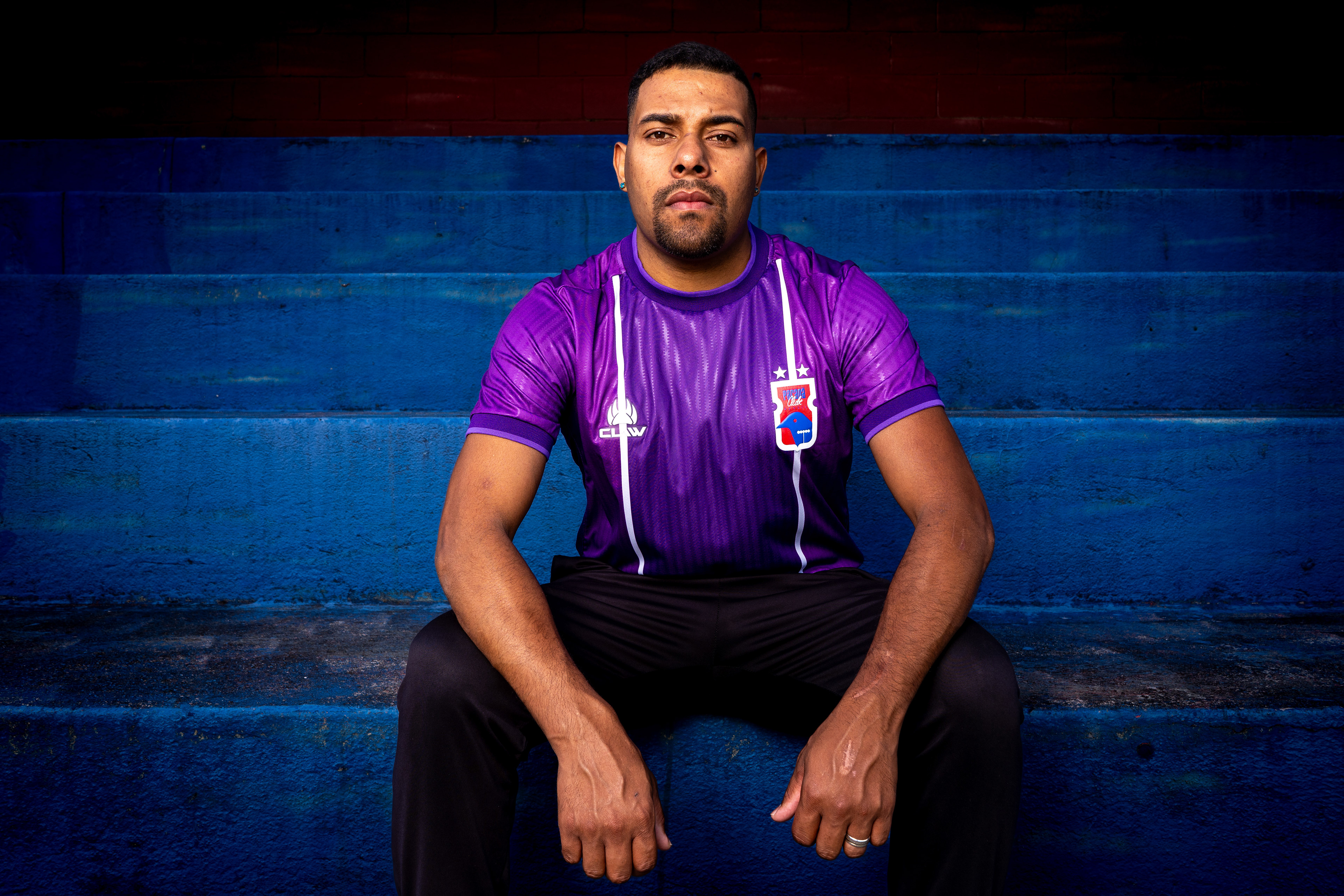
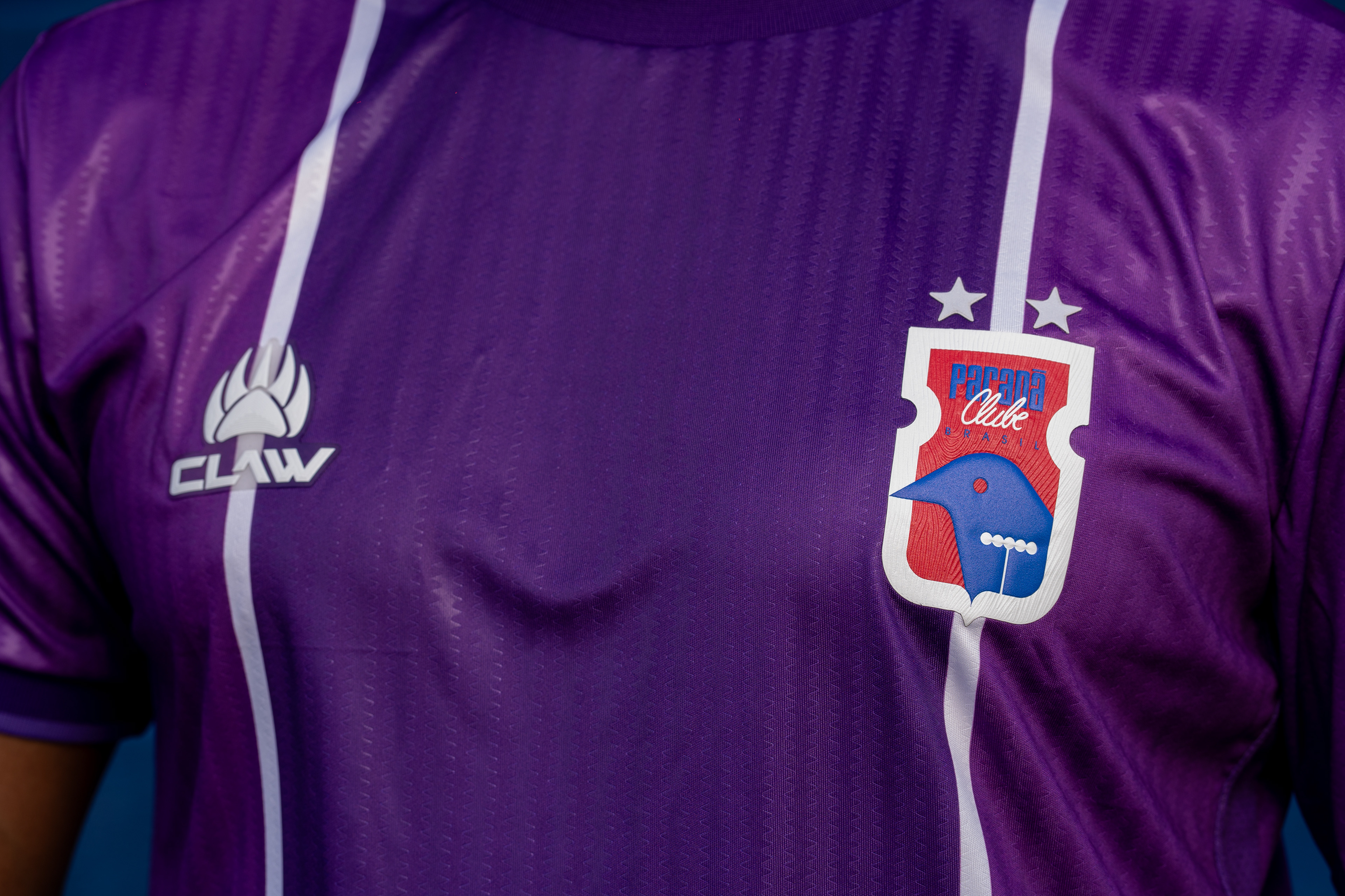
PT: A linha de goleiros da coleção "Raízes", batizada de "Guardiões", simboliza o nosso compromisso em voltar a conquistar a hegemonia no estado. Inspirado na icônica camisa usada durante o nosso histórico pentacampeonato (1997), o design celebra a proteção e a segurança das nossas raízes.
A grande sacada criativa desta linha está na camisa titular ser roxa, uma cor que representa a fusão direta e literal das nossas cores tradicionais: o vermelho e o azul. Para diferenciar as peças dos goleiros das camisas de linha, utilizamos uma textura vertical exclusiva no tecido, garantindo um visual imponente. A coleção se completa com mais quatro opções de cores (azul, vermelho, cinza e amarelo), proporcionando variedade sem perder a identidade e o estilo.
EN: The goalkeeper line from the "Roots" collection, named "Guardians," symbolizes our commitment to regaining state hegemony. Inspired by the iconic jersey worn during our historic 5-time state championship victory (1997), the design celebrates the protection and security of our roots.
The major creative highlight of this line is the home goalkeeper kit being purple, a color that represents the direct and literal fusion of our traditional colors: red and blue. To differentiate the goalkeeper pieces from the outfield kits, we utilized an exclusive vertical texture on the fabric, ensuring an imposing look. The collection is completed with four additional color options (blue, red, gray, and yellow), providing variety without losing identity and style.
Das raízes ao acesso.
Obrigado por fazer parte dessa história.
From the roots to promotion.
Thanks for watching!
Daniel Momm e Leandro Arruda.